Table of Contents
Angular Autocomplete select components are a staple of modern web applications and improve the user experience by making intelligent suggestions as you type. In this article, we’ll dive into creating a versatile, user-friendly Angular autocomplete select component that you can use in forms. Whether you’re an Angular pro or a beginner, this guide will simplify the process while focusing on functionality, accessibility, and customization.
Watch the Angular Autocomplete Select component in Action!
Check out this quick video to see how the angular autocomplete select component works with a real example!
<dnc-autocomplete [items]="languages"
                  formControlName="language"
                  displayProperty="name"
                  bindingProperty="code"
                  initialValue="en"
(itemSelected)="onItemSelected($event)"/>If you’re interested in creating reusable Select component in other frameworks, you might find my Building a Reusable Blazor Select Component Guide helpful
Why Use an Angular Autocomplete Select Component?
The Autocomplete Select component simplifies input by allowing users to select from predefined options instead of typing complete entries. It reduces errors and ensures consistent data formatting making it an essential tool for modern web applications.
Features of the Angular Autocomplete Select Component
- Dynamic search: Filter suggestions based on user input.
- Versatile input types: Processes arrays of objects or strings.
- Customizable display: Choose what the user sees via
displayProperty. - Flexible binding: Use
bindingPropertyto bind specific values. - Emit property or full object: Use
emitPropertyto choose whether to emit a property. You can also emit the full object. This choice offers complete flexibility. - Integration with Reactive Forms: Seamless integration with Angular forms.
- Accessible keyboard navigation: Use arrow keys and Enter to select.
Set Up Your Angular Project
We use the new command of the Angular CLI. We pass the name of the application that we want to create as an option. To do so, go to a folder of your choice and type the following.
ng new autocomplete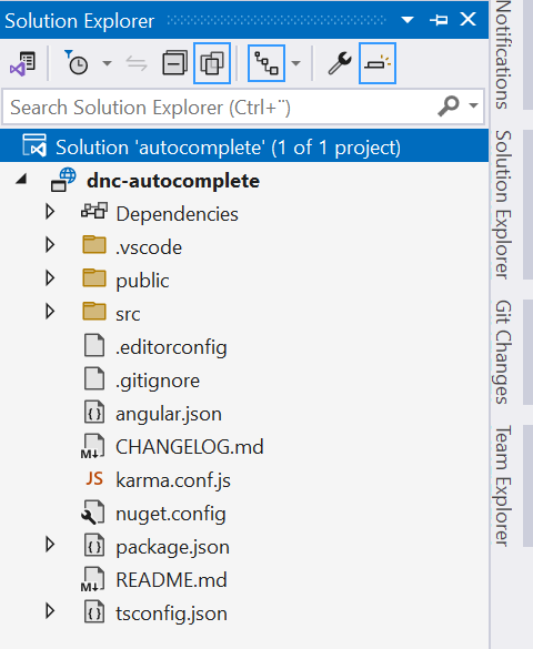
Generate the Angular Autocomplete Select Component
Use the Angular CLI to create a new reusable component:
ng generate component dnc-autocomplete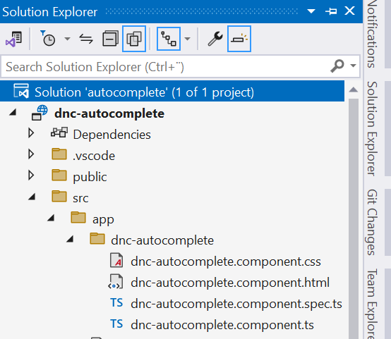
Add functionality to your component in dnc-autocomplete.component.ts file by defining Inputs and Outputs first:
items: The list of items to display.displayProperty: The property to display in the dropdown.bindingProperty: (Optional) The property to bind when selecting.initialValue: The initial selected value.placeholderText: Placeholder for the search box.itemSelected: Emits the selected item or value.emitProperty: Whether to emit only the property or the full object.
We need to make our Angular Autocomplete Select component compatible with FormControlName by implementing ControlValueAccessor interface that acts as a bridge between the Angular forms API and a native element in the DOM.
This will allow your custom component to work seamlessly in Angular reactive forms as you see in the dnc-autocomplete.component.ts.
import { Component, EventEmitter, forwardRef, Input, Output, SimpleChanges } from "@angular/core";
import { ControlValueAccessor, NG_VALUE_ACCESSOR } from "@angular/forms";

@Component({
  selector: 'dnc-autocomplete',
  templateUrl: './dnc-autocomplete.component.html',
  styleUrl: './dnc-autocomplete.component.css',
  providers: [
    {
      provide: NG_VALUE_ACCESSOR,
      useExisting: forwardRef(() => DncAutocompleteComponent),
      multi: true
    }
  ]
})
export class DncAutocompleteComponent implements ControlValueAccessor {
  @Input() items: (string | { [key: string]: any })[] = [];
  @Input() displayProperty: string = '';
  @Input() bindingProperty: string | null = null;
  @Input() initialValue: any = null;
  @Input() placeholderText: string = 'Search...';
  @Input() emitProperty: boolean = true;

  @Output() itemSelected = new EventEmitter<string | { [key: string]: any } | null>();

  filteredItems: (string | { [key: string]: any })[] = [];
  searchText: string = '';
  noResultsFound: boolean = false;
  activeIndex = -1;
  isDisabled: boolean = false;

  private initialSet = false;
  private onChange: (value: any | null) => void = () => { };
  private onTouched: () => void = () => { };

  constructor() { }

  ngOnInit(): void {
    this.setInitialItem();
  }

  ngOnChanges(changes: SimpleChanges): void {
    if (changes['items'] || changes['initialValue']) {
      this.setInitialItem();
    }
  }

  private setInitialItem(): void {
    if (this.initialSet || !this.items || this.initialValue == null) {
      return;
    }

    const initialItem = this.items.find(item =>
      this.getSafeProperty(item, this.bindingProperty || this.displayProperty) === this.initialValue
    );

    if (initialItem) {
      this.searchText = this.getSafeProperty(initialItem, this.displayProperty); // Use displayProperty for the input text
      this.onChange(this.initialValue);
      this.itemSelected.emit(initialItem);
      this.initialSet = true;
    }
  }

  getSafeProperty(item: any, property: string | null): string {
    if (item == null || property == null) return '';
    if (typeof item === 'object') {
      return item[property] != null ? String(item[property]) : '';
    }
    return String(item);
  }

  onSearch(): void {
    const query = this.searchText.trim().toLowerCase();

    if (query === '') {
      this.resetSearch();
      return;
    }

    this.filteredItems = this.items.filter(item =>
      this.getSafeProperty(item, this.displayProperty).toLowerCase().includes(query)
    );

    this.noResultsFound = this.filteredItems.length === 0;
    this.activeIndex = -1;
  }

  resetSearch(): void {
    this.filteredItems = [];
    this.noResultsFound = false;
    this.onChange(null);
    this.itemSelected.emit(null);
  }

  selectItem(item: any): void {
    const displayValue = this.getSafeProperty(item, this.displayProperty);
    const bindingValue = this.getSafeProperty(item, this.bindingProperty || this.displayProperty);

    this.searchText = displayValue;

    if (this.emitProperty) {
      this.onChange(bindingValue);
    } else {
      this.onChange(item);
    }

    this.itemSelected.emit(item);

    this.filteredItems = [];
    this.noResultsFound = false;
    this.activeIndex = -1;
  }

  onKeydown(event: KeyboardEvent): void {
    if (this.filteredItems.length === 0) {
      return;
    }

    if (event.key === 'ArrowDown') {
      this.activeIndex = (this.activeIndex + 1) % this.filteredItems.length;
      event.preventDefault();
    } else if (event.key === 'ArrowUp') {
      this.activeIndex =
        (this.activeIndex - 1 + this.filteredItems.length) % this.filteredItems.length;
      event.preventDefault();
    } else if (event.key === 'Enter' && this.activeIndex >= 0) {
      this.selectItem(this.filteredItems[this.activeIndex]);
    }
  }


  writeValue(value: any | null): void {
    let item;

    if (this.emitProperty) {
      item = this.items.find(item =>
        this.getSafeProperty(item, this.bindingProperty || this.displayProperty) === String(value)
      );
    } else {
      item = this.items.find(i => i === value);
    }

    if (item) {
      this.searchText = this.getSafeProperty(item, this.displayProperty);
    } else {
      this.searchText = '';
    }
  }

  registerOnChange(fn: (value: any | null) => void): void {
    this.onChange = fn;
  }

  registerOnTouched(fn: () => void): void {
    this.onTouched = fn;
  }

  setDisabledState(isDisabled: boolean): void {
    this.isDisabled = isDisabled;
  }

  validate(): { [key: string]: any } | null {
    const isValid = this.items.some(item =>
      this.getSafeProperty(item, this.bindingProperty || this.displayProperty) === this.searchText
    );
    return isValid ? null : { invalidSelection: true };
  }
}
initialValue and itemSelected can serve a useful purpose depending on the specific use case and how the component is used.ItemSelected can serve as a secondary notification mechanism. It allows the parent to respond to changes without reading the value of the form control. For example, you can use it if your component is used as a standalone widget and not as part of an Angular form. Alternatively, the parent component need to respond to selections in real time.
HTML Template for the Angular Autocomplete Select Component
Add the following code to the dnc-autocomplete.component.html file.
<div class="dnc-list-container">
  <!-- Input for search -->
  <input type="text"
         class="form-control"
         [(ngModel)]="searchText"
         (input)="onSearch()"
         (keydown)="onKeydown($event)"
         [placeholder]="placeholderText" />

  <!-- Filtered items -->
  <ul *ngIf="filteredItems.length > 0">
    <li *ngFor="let item of filteredItems; let i = index"
        (click)="selectItem(item)"
        [class.active]="i === activeIndex">
      {{ getSafeProperty(item, displayProperty) }}
    </li>
  </ul>

  <!-- No results message -->
  <div *ngIf="noResultsFound && searchText">
    <ul>
      <li>No results found</li>
    </ul>
  </div>
</div>
How to Use the Angular Autocomplete Select Component
The Angular Autocomplete Select component is easy to use and flexible for setup. Just add it to your template, pass your data to the items input and use displayProperty to display what users will see in the dropdown. You can also use bindingProperty to bind to different property or to decide what to save or emitted as show below.
<dnc-autocomplete [items]="departments"
                  formControlName="departmentId"
                  displayProperty="name"
                  bindingProperty="id"/>
The Angular Autocomplete Select component works seamlessly with both reactive and template-driven forms. For template-driven forms, simply bind it with ngModel.
Below are examples for both approaches:
Also read https://dotnetcoder.com/creating-a-reusable-blazor-search-component/
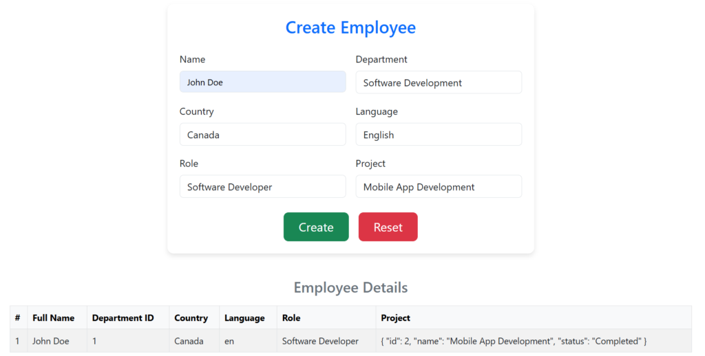
Reactive Forms
<form [formGroup]="employeeForm" (ngSubmit)="createEmployee()">
  <div class="row g-3">
    <div class="col-md-6">
      <label for="name" class="form-label">Name</label>
      <input class="form-control"
             id="name"
             formControlName="name"
             placeholder="Enter name"
             required />
    </div>
    <div class="col-md-6">
      <label for="department" class="form-label">Department</label>
      <dnc-autocomplete [items]="departments"
                        formControlName="departmentId"
                        displayProperty="name"
                        bindingProperty="id" />
    </div>
    <div class="col-md-6">
      <label for="country" class="form-label">Country</label>
      <dnc-autocomplete [items]="countries"
                        formControlName="country"
                        [displayProperty]="'name'" />
    </div>
    <div class="col-md-6">
      <label for="language" class="form-label">Language</label>
      <dnc-autocomplete [items]="languages"
                        formControlName="language"
                        displayProperty="name"
                        bindingProperty="code"
                        initialValue="en"/>
    </div>
    <div class="col-md-6">
      <label for="role" class="form-label">Role</label>
      <dnc-autocomplete [items]="roles"
                        formControlName="role" />
    </div>
    <div class="col-md-6">
      <label for="project" class="form-label">Project</label>
      <dnc-autocomplete [items]="projects"
                        formControlName="project"
                        [displayProperty]="'name'"
                        [emitProperty]="false" />
    </div>
  </div>
  <div class="text-center mt-4">
    <button class="btn btn-success btn-lg px-4"
            type="submit"
            [disabled]="!employeeForm.valid">
      Create
    </button>
    <button class="btn btn-danger btn-lg px-4 ms-3"
            type="button"
            (click)="reset()">
      Reset
    </button>
  </div>
</form>
// Removed code for brevity
countries: { id: number, name: string, code: string }[] = [];
languages: { id: number, name: string, code: string }[] = [];
projects: { id: number, name: string, status: string }[] = [];
departments: { id: number, name: string }[] = [];
roles: string[] = [
"Software Developer",
"Project Manager",
"Quality Assurance Engineer",
"DevOps Engineer",
"UI/UX Designer",
"Business Analyst",
"Product Manager",
"Database Administrator",
"System Administrator",
"Cybersecurity Specialist"
];
employees: Employee[] = [];
createEmployee(): void {
if (this.employeeForm.valid) {
console.log(this.employeeForm.value);
this.employees.push(this.employeeForm.value);
this.reset()
}
}
reset(): void {
this.employeeForm.reset();
}
ngOnInit(): void {
this.loadData<{ id: number, name: string, code: string }[]>('countries.json', data => this.countries = data);
this.loadData<{ id: number, name: string }[]>('departments.json', data => this.departments = data);
this.loadData<{ id: number, name: string, code: string }[]>('languages.json', data => this.languages = data);
this.loadData<{ id: number, name: string, technologies: string[], status: string }[]>('projects.json', data => this.projects = data);
}
private loadData<T>(url: string, callback: (data: T) => void): void {
this.http.get<T>(url).subscribe(callback, error => console.error(`Error loading data from ${url}:`, error));
}
Template-Driven Forms
  <form #courseForm="ngForm">
      <div>
        <dnc-autocomplete name="course"
                          [(ngModel)]="selectedCourse"
                          [items]="courses"
                          displayProperty="name"
                          bindingProperty="code"
                          placeholderText="Select a course"></dnc-autocomplete>
    </div>
    <button type="submit">Submit</button>
  </form>

 <p>Selected course : {{selectedCourse }}</p>
// Template driven
selectedCourse = null;
courses: { id: number, name: string, code: string }[] = [
{ id: 1, name: "Introduction to Programming", code: "CS101" },
{ id: 2, name: "Data Structures and Algorithms", code: "CS102" }
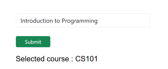
];We display the course name and bind to the course code in this case.
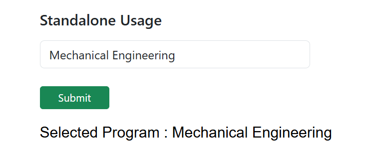
Finally, if you’re not using forms, you can still use DncAutocompleteComponent as a standalone component and capture the user’s selection with the itemSelected output.
Standalone Usage
<dnc-autocomplete [items]="programs"
                    displayProperty="name"
                    (itemSelected)="onProgramSelected($event)"
                    placeholderText="Select a program"></dnc-autocomplete>
</div>

<button type="submit" class="btn btn-success btn-sm px-4">Submit</button>

<p>Selected Program : {{selectedProgram || 'None'}}</p>
// Standalone usage
selectedProgram = null;
programs: { id: number, name: string, code: string }[] = [
{ id: 1, name: "Computer Science", code: "CS101" },
{ id: 3, name: "Mechanical Engineering", code: "ME303" }
];
onProgramSelected(program: any) {
this.selectedProgram = program.name;
}Please note that the itemSelected output emits the entire object.
Conclusion
With this powerful Angular Autocomplete Select Component, you can improve form usability and create better user experiences. It’s designed to be flexible, customizable, and developer-friendly. Give it a try and see how it transforms your forms!
Also read https://dotnetcoder.com/aspnet-core-web-api-best-practices-and-tips/
Sample code
You can find the entire example code for Angular Autocomplete Select Component project on my GitHub repository


