Table of Contents
Introduction
The reusable Blazor dropdown list is an interactive web UI in C# that encapsulates a standard dropdown menu and provides the ability to customize its functionality.
In this post, we will create a Blazor dropdown list component that can be easily integrated into different projects without having to write a separate component for each project.
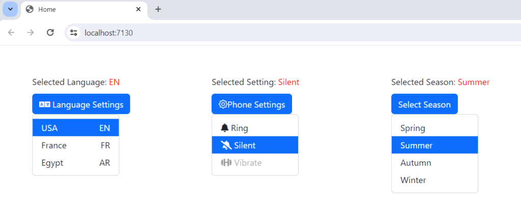
Take a look at the finished Blazor dropdown list component implemented in a Blazor Web App.
<DncDropdown TItem="Country" OnSelected="@HandleSelectedLanguage">
    <DncDropdownButton TItem="Country"><i class="fas fa-language"></i> Language Settings</DncDropdownButton>
    <DncDropdownMenu TItem="Country">
        @foreach (var country in countries)
        {
            <DncDropdownItem Item="@country" Value="(Country v) => v.Language">
                @context.Name @context.Language
            </DncDropdownItem>
        }
    </DncDropdownMenu>
</DncDropdown>Creating a Dropdown Solution and adding a Razor class library project
Open Visual Studio and create a blank solution named Dropdown . Add a new Razor Class library named Dnc.Common.Razor to the solution. Select .NET 8 (Long Term Support) as the target Framework.
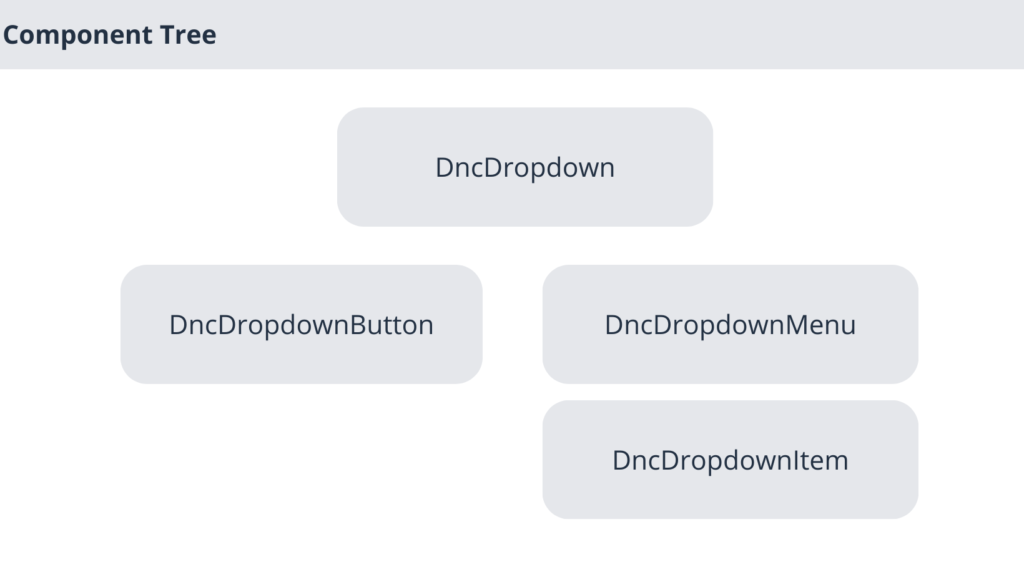
Blazor Dropdown Component Tree
The dropdown consists of four components that interact with each other.
Note how the components are arranged next to each other in the component structure.

Creating the DncDropdown component
First, create a new folder in the Dnc.Common.Razor project named Dropdown. Then, create a new class file called DncDropdown, and identify it as a generic class with a single generic parameter called TItem, and add the following code.
@typeparam TItem
<CascadingValue Value="@this">
    <div class="dropdown">
        @ChildContent
    </div>
</CascadingValue>

@code {
    [Parameter]
    public RenderFragment ChildContent { get; set; }

    [Parameter]
    public EventCallback<TItem> OnSelected { get; set; }

    public bool Show { get; private set; }

    private object selectedValue;

    public object SelectedValue {
        get
        {
            return this.selectedValue;
        }
        set
        {
            this.selectedValue = value;
            StateHasChanged();
        }
    }


    public void Toggle()
    {
        Show = !Show;
        StateHasChanged();
    }

    public async Task HandleSelect(TItem item, object selectedValue)
    {
        this.SelectedValue = selectedValue;
        Show = false;
        StateHasChanged();
        await this.OnSelected.InvokeAsync(item);
    }
}
The dncDropdown component makes itself available as a cascading value and injects the embedded content into component ChildContent , as you see below.
<CascadingValue Value="@this">
    <div class="dropdown">
        @ChildContent
    </div>
</CascadingValue>
We have defined a RenderFragment property in DncDropdown that allows us to inject the embedded content into the component, Then we declared EventCallback<TItem> parameters, so that the Blazor dropdown component notifies consumers when the value has been selected.
    [Parameter]
    public RenderFragment ChildContent { get; set; }

    [Parameter]
    public EventCallback<TItem> OnSelected { get; set; }
The Toggle method is used by the DncDropdownButton component to show and hide the dropdown items, while the HandleSelect method is used by the child component DncDropdownItem and is responsible for triggering the OnSelect event when the value has been selected and notifying the component that it needs to be re-rendered by calling StateHasChanged , as you will see later.
public void Toggle()
{
    Show = !Show;
    StateHasChanged();
}

public async Task HandleSelect(TItem item, object selectedValue)
{
    this.SelectedValue = selectedValue;
    Show = false;
    StateHasChanged();
    await this.OnSelected.InvokeAsync(item);
}
Creating the DncDropdownMenu and DncDropdownButton components
Create two files in the Dropdown folder with the names DncDropdownButton.razor and DncDropdownItem.razor . as follows.
@typeparam TItem

<button class="btn btn-primary" @onclick="HandleClick" type="button" id="dropdownMenuButton" data-toggle="dropdown" aria-haspopup="true" aria-expanded="false">
    @ChildContent
</button>

@code {

    [CascadingParameter]
    public DncDropdown<TItem> DncDropdown { get; set; }

    [Parameter]
    public RenderFragment ChildContent { get; set; }

    private void HandleClick()
    {
        this.DncDropdown.Toggle();
    }

}
The DncDropdownButton component is responsible for showing and hiding the dropdown items by triggering the Toggle method in the parent component DncDropdown.
@typeparam TItem

@if (DncDropdown.Show)
{
    <div class="dropdown-menu show" aria-labelledby="dropdownMenuButton">
        @ChildContent
    </div>
}


@code {
    [CascadingParameter]
    public DncDropdown<TItem> DncDropdown { get; set; }

    [Parameter]
    public RenderFragment ChildContent { get; set; }

}
the DncDropdownMenu only serves as a container for the dropdown items.
Also read https://dotnetcoder.com/azure-service-bus-integration-with-asp-net-core-web-api/
Creating the DncDropdownItem component
Create a new file named DncDropdownItem.razor and mark it as a generic with two generic parameters named TItem and TValue as in the following code.
@using System.Linq.Expressions
@typeparam TItem
@typeparam TValue

<div class="dropdown-item @CssSelected @isDisabled" data-value="@ItemValue" Item="@Item" @onclick="e=> DncDropdown.HandleSelect(Item, ItemValue)">
    @if (HasChild)
    {
        @ChildContent(Item)
    }
    else
    {
        @ItemValue
    }
</div>


@code {
    [CascadingParameter]
    public DncDropdown<TItem> DncDropdown { get; set; }

    [Parameter]
    public RenderFragment<TItem> ChildContent { get; set; }

    [Parameter]
    public TItem Item { get; set; }

    [Parameter]
    public Expression<Func<TItem, TValue>> Value { get; set; }

    [Parameter]
    public bool Selected { get; set; }

    [Parameter]
    public bool Disabled { get; set; }

    private bool HasChild => ChildContent != null;

    private string isDisabled => Disabled ? "disabled" : "";

    private object ItemValue => GetValue(Value);

    private string CssSelected
    {
        get
        {
            if (DncDropdown.SelectedValue == null && Selected)
            {
                return "selected";
            }
            else
            {
                return ItemValue?.ToString() == DncDropdown.SelectedValue?.ToString() ? "selected" : "";
            }

        }
    }

    private object GetValue(Expression<Func<TItem, TValue>> expression)
    {
        var compiledExpression = expression.Compile();
        try
        {
           return compiledExpression(Item);

        }
        catch
        {
            return null;
        }
    }
}
The DncDropdownItem component receives an expression tree parameter that represents a lambda expression of type Expression<Func<TItem, TValue>>.
Expression is a data structure that represents a code expression and can be executed at runtime using the Compile method to create an executable delegate.
private object GetValue(Expression<Func<TItem, TValue>> expression)
{
    var compiledExpression = expression.Compile();
    try
    {
       return compiledExpression(Item);

    }
    catch
    {
        return null;
    }
}
The GetValue method is responsible for compiling the expression and calling the delegate to get the ItemValue, as you can see in the code above.
We declared also the following parameters.
[Parameter]
public RenderFragment<TItem> ChildContent { get; set; }

[Parameter]
public TItem Item { get; set; }
The parameter ChildContent of type RenderFragment<TItem> is used to inject embedded content into the component and to pass the Item data into the RenderFragment if the div element has a child. Otherwise we only display the calculated ItemValue , as you can see below.
@if (HasChild)
{
    @ChildContent(Item)
}
else
{
    @ItemValue
}
Finally, the Selected and Disabled parameters are used to set a style and disable the click event if the Disabled parameter is true. disabled is not a valid property for div, so we used CSS to emulate it, as you can see in the CSS file DncDropdownItem.razor.css , which is not part of the topic of this post.
.selected {
    color: #fff;
    background-color: #0d6efd;
}

.disabled {
    pointer-events: none;
    opacity: 0.9;
}

.dropdown-item {
    width: 100%;
}
.dropdown-item:active {
    background-color: #80aded;
}
Using the Blazor Dropdown component in a Blazor Web App
First, add a new Blazor Web App project template called Dnc.Dropdown.WebApp to the solution. I have selected .NET 8 (Long Term Support) as the target Framework.
Second reference the Dnc.Common.Razor project to the Dnc.Dropdown.WebApp project, and update the _Imports.razor as follows.
// Removed code for brevity
@using Dnc.Common.Razor.Dropdown
Then include the bootstrap and font awesome links in the App.razor file, as shown below.
<link rel="stylesheet" href="https://cdn.jsdelivr.net/npm/bootstrap-icons@1.11.1/font/bootstrap-icons.css">
<link rel="stylesheet" href="https://cdnjs.cloudflare.com/ajax/libs/font-awesome/5.15.1/css/all.min.css">
Finally, add the following code to the Home.razor file and run the application.
We could use the Localizer Service component with the Blazor Dropdown component, but I decided to leave it simple.
@page "/"

<PageTitle>Home</PageTitle>

<div class="container my-5">
    <div class="row my-1">
        <div class="col-2 dnc-align-left">
            <div>Selected Language: <span class="dnc-red">@selectedLanguageSetting</span></div>
        </div>
        <div class="col-1"></div>
        <div class="col-2 dnc-align-left">
            <div>Selected Setting: <span class="dnc-red">@selectedCallSetting</span></div>
        </div>
        <div class="col-1"></div>
        <div class="col-2 dnc-align-left">
            <div>Selected Season: <span class="dnc-red">@selectedSeason</span></div>
        </div>
    </div>
    <div class="row my-1">
        <div class="col-2">
            <DncDropdown TItem="Country" OnSelected="@HandleSelectedLanguage">
                <DncDropdownButton TItem="Country"><i class="fas fa-language"></i> Language Settings</DncDropdownButton>
                <DncDropdownMenu TItem="Country">
                    @foreach (var country in countries)
                    {
                        <DncDropdownItem Item="@country" Value="(Country v) => v.Language">
                            <div class="dnc-div">@context.Name<span class="dnc-span">@context.Language</span></div>
                         </DncDropdownItem>
                    }
                </DncDropdownMenu>
            </DncDropdown>
        </div>
        <div class="col-1"></div>
        <div class="col-2">
            <DncDropdown TItem="string" OnSelected="@HandleSelectedCall">
                <DncDropdownButton TItem="string"><i class="bi bi-gear"></i>Phone Settings</DncDropdownButton>
                <DncDropdownMenu TItem="string">
                    <DncDropdownItem Item="@list[0]" Value="(string v) => v"><i class="fas fa-bell"></i> @list[0]</DncDropdownItem>
                    <DncDropdownItem Item="@list[1]" Value="(string v) => v" Selected="true"><i class="fas fa-bell-slash"></i> @list[1]</DncDropdownItem>
                    <DncDropdownItem Item="@list[2]" Value="(string v) => v" Disabled="true"><i class="fas fa-dumbbell"></i> @list[2]</DncDropdownItem>
                </DncDropdownMenu>
            </DncDropdown>
        </div>
        <div class="col-1"></div>
        <div class="col-2">
            <DncDropdown TItem="Season" OnSelected="@HandleSelectedSeason">
                <DncDropdownButton TItem="Season">Select Season</DncDropdownButton>
                <DncDropdownMenu TItem="Season">
                    @foreach (var season in seasons)
                    {
                        <DncDropdownItem Item="season" Value="(Season v) => v"></DncDropdownItem>
                    }
                </DncDropdownMenu>
            </DncDropdown>
        </div>
    </div>
</div>

@code {

    static List<Country> countries;
    static List<string> list;

     IEnumerable<Season> seasons = Enum.GetValues(typeof(Season)).Cast<Season>();

    string selectedLanguageSetting = string.Empty;
    string selectedCallSetting = "Silent";
    string selectedSeason;

    protected override void OnInitialized()
    {
        countries = new List<Country>
        {
         new Country{ Name = "USA", Language = "EN"},
         new Country{ Name = "France", Language = "FR"},
         new Country{ Name = "Egypt", Language = "AR"}
        };

        list = new List<string> { "Ring", "Silent", "Vibrate" };
    }

    protected void HandleSelectedLanguage(Country  value)
    {
        this.selectedLanguageSetting = value?.Language;
    }

    protected void HandleSelectedCall(string value)
    {
        this.selectedCallSetting = value;
    }

    protected void HandleSelectedSeason(Season value)
    {
        this.selectedSeason = value.ToString();
    }

    public class Country
    {
        public string Name { get; set; }
        public string Language { get; set; }
    }

    public enum Season
    {
        Spring = 0,
        Summer = 1,
        Autumn = 2,
        Winter =3
    }
}
I have used different objects for use with the Blazor dropdown list component, as you can see in the self-explanatory code above.

Conclusion
In this post, we created a Blazor Dropdown list component that you can use in your various projects.
The code for the reusable Blazor Dropdown list component can be found Here.
Also read https://dotnetcoder.com/azure-cosmos-db-repository-pattern-c/


