Table of Contents
Modal windows are an essential part of modern web applications, enabling developers to create targeted, interactive user experiences. Whether you’re displaying alerts, confirming actions, or embedding forms, reusable Angular modal components save time and effort by providing consistent, flexible functionality across your entire application.
In this post, we’ll introduce a simple but powerful reusable Angular modal component, explain its features, and find out why it’s a must-have in your Angular toolkit.
Watch the Reusable Angular Modal Component in Action!
Check out this quick video to see how the Reusable Angular Modal Component works with a real example!
<dnc-modal #modal
           [size]="'large'"
           [clickBackdropToClose]="true"
           (closed)="onModalClose()">
  <div modal-header>
    <h5 class="modal-title">Header</h5>
  </div>
  <div modal-body>
    Modal Body
  </div>
  <div modal-footer>
    <button type="button" class="btn btn-danger mx-2" (click)="save()">Save</button>
    <button type="button" class="btn btn-secondary" (click)="modal.hide()">Cancel</button>
  </div>
</dnc-modal>
If you’re interested in creating reusable Modal component in other frameworks, you might find my Creating a Reusable Blazor Modal Component Guide helpful
Why Use a Reusable Angular Modal Component?
- Saves Development Time: Write once, use anywhere.
- Ensures Consistency: Offers uniform styling and behavior across your app.
- Improves User Experience: Supports animations, click-to-dismiss functionality, and responsive design.
- Simplifies Maintenance: Centralized updates for new features or fixes.
If you’re struggling with multiple modal implementations, this guide will show you how to simplify your workflow.
Key Features of This Angular Modal Component
Easy to Use and Lightweight
Integrate it into any Angular project effortlessly with Minimal CSS and efficient Angular code.
Customizable Size
You can adjust the modal size (small, normal, or large) to suit the content it displays.
Backdrop Click-to-Close
Easily configure whether users can close the modal by clicking outside it.
Animation
Built-in fade animations provide a polished user experience.
Content Slots
Leverage ng-content to define custom headers, bodies, and footers.
Event Handling
The component emits an event on closure, allowing seamless integration with parent components.
Also read https://dotnetcoder.com/creating-a-reusable-blazor-modal-component/
Set Up Your Angular Project
We use the new command of the Angular CLI. We pass the name of the application that we want to create as an option. To do so, go to a folder of your choice and type the following.
ng new modalUse then the Angular CLI to create a new component.
ng generate component dnc-modal
How to Implement the Component
We’ll look at the key pieces that make this component work.
Component Code
The DncModalComponent class uses Angular’s @Input and @Output decorators to manage modal visibility and events. Here’s how it works:
import { Component, Input, Output, EventEmitter } from '@angular/core';
import { trigger, style, transition, animate } from '@angular/animations';

@Component({
  selector: 'dnc-modal',
  templateUrl: './dnc-modal.component.html',
  styleUrls: ['./dnc-modal.component.css'],
  animations: [
    trigger('fade', [
      transition(':enter', [
        style({ opacity: 0 }),
        animate('300ms ease-in', style({ opacity: 1 })),
      ]),
      transition(':leave', [
        animate('300ms ease-out', style({ opacity: 0 })),
      ]),
    ]),
  ],
})
export class DncModalComponent {
  @Input() visible = false;
  @Input() size: 'small' | 'normal' | 'large' = 'normal';
  @Input() clickBackdropToClose = true;

  @Output() closed = new EventEmitter<void>();

  constructor() { }

  show(): void {
    this.visible = true;
  }

  hide(): void {
    this.visible = false;
    this.closed.emit();
  }

  onBackdropClick(event: MouseEvent): void {
    if (this.clickBackdropToClose && event.target === event.currentTarget) {
      this.hide();
    }
  }

  getModalSizeClass(): string {
    switch (this.size) {
      case 'small':
        return 'dnc-modal-sm';
      case 'large':
        return 'dnc-modal-lg';
      default:
        return 'dnc-modal-md';
    }
  }
}
HTML Template Breakdown
The backbone of this modal component is its HTML template, which controls how the modal looks and behaves. Here’s the code:
<div *ngIf="visible"
     class="dnc-modal-backdrop"
     @fade
     (click)="onBackdropClick($event)">
  <div class="dnc-modal-dialog"
       [ngClass]="getModalSizeClass()"
       role="dialog"
       aria-modal="true">
    <div class="dnc-modal-content">
      <!-- Header -->
      <div class="dnc-modal-header">
        <ng-content select="[modal-header]"></ng-content>
        <button type="button"
                class="btn-close"
                aria-label="Close"
                (click)="hide()"></button>
      </div>

      <!-- Body -->
      <div class="dnc-modal-body">
        <ng-content select="[modal-body]"></ng-content>
      </div>

      <!-- Footer -->
      <div class="dnc-modal-footer">
        <ng-content select="[modal-footer]"></ng-content>
      </div>
    </div>
  </div>
</div>
Key Elements of the Template
(*ngIf="visible")
Controls whether the modal is displayed. If visible is true, the modal is displayed, otherwise it is hidden.
Backdrop (dnc-modal-backdrop)
- Adds a dimmed background behind the modal.
- Handles the “click to close” functionality through
(click)="onBackdropClick($event)".
Dialog Box (dnc-modal-dialog)
Adjusts the size dynamically via [ngClass]="getModalSizeClass()" (e.g., small, normal, or large).
Content slots (ng-content)
- Enables the insertion of custom HTML for the header, body, and footer using Angular’s content projection:
[modal-header]: Define your modal header here.[modal-body]: Insert the main content or forms.[modal-footer]: Insert footer elements such as buttons.
Close button (btn-close)
A simple close button in the header that calls the hide() method when clicked.
Styling the Modal for a Modern Look
Add the following CSS to style your modal with a professional appearance:
/* Modal Backdrop */
.dnc-modal-backdrop {
  position: fixed;
  top: 0;
  left: 0;
  width: 100%;
  height: 100%;
  display: flex;
  align-items: center;
  justify-content: center;
  background-color: rgba(0, 0, 0, 0.6);
  z-index: 1050;
}

/* Modal Dialog */
.dnc-modal-dialog {
  max-width: 100%;
  margin: 0;
}

.dnc-modal-sm { max-width: 300px; }
.dnc-modal-md { max-width: 500px; }
.dnc-modal-lg { max-width: 800px; }

.dnc-modal-content {
  background: #fff;
  border-radius: 0.5rem;
  overflow: hidden;
  box-shadow: 0 5px 15px rgba(0, 0, 0, 0.5);
}

/* Modal Header */
.dnc-modal-header {
  display: flex;
  align-items: center;
  justify-content: space-between;
  padding: 1rem 1.5rem;
  border-bottom: 1px solid #dee2e6;
  background-color: #f8f9fa;
}

  .dnc-modal-header ng-content {
    flex-grow: 1;
  }

.btn-close {
  border: none;
  font-size: 1.25rem;
  line-height: 1;
  color: #6c757d;
  cursor: pointer;
}

  .btn-close:hover {
    color: #343a40;
  }

/* Modal Body */
.dnc-modal-body {
  padding: 1.5rem;
}

/* Modal Footer */
.dnc-modal-footer {
  display: flex;
  justify-content: flex-end;
  padding: 1rem 1.5rem;
  border-top: 1px solid #dee2e6;
  background-color: #f8f9fa;
}
Common Issues and How to Avoid Them
- Modal does not close on backdrop click: Check whether
clickBackdropToCloseis set totrue. - Animations feel clunky: Make sure you import the
BrowserAnimationsModulein your Angular app module. - The size of the modal does not change: Check the value of the
sizeinput (small,normal,large) and make sure the styles are defined.
How to Use the Reusable Angular Modal Component
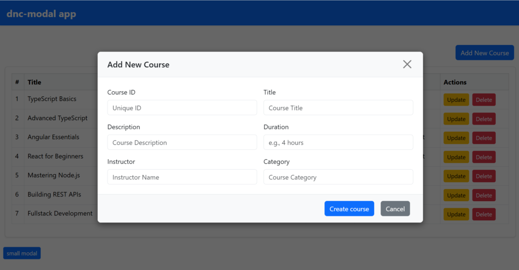
Using the reusable Angular modal component is straightforward and allows for seamless integration into your application. Start by embedding the element in your HTML, defining the size with the [size] property (e.g. ‘small‘, ‘normal‘, ‘large‘) and defining the content via blocks with modal-header, modal-body and modal-footer. A modal for adding a new course can, for example, contain input fields in the body and action buttons in the footer.
<div class="text-end mb-3">
  <button class="btn btn-md btn-primary mx-3" (click)="showAddModal()">Add New Course</button>
</div>

<dnc-modal #AddCourseModal
           [size]="'large'"
           [clickBackdropToClose]="true"
           (closed)="onModalClose()">
  <div modal-header>
    <h5 class="modal-title">Add New Course</h5>
  </div>
  <div modal-body>
    <div class="form-section">
      <form>
        <div class="row g-3">
          <div class="col-md-6">
            <label for="id" class="form-label">Course ID</label>
            <input type="number" class="form-control" id="id" placeholder="Unique ID">
          </div>
          <div class="col-md-6">
            <label for="title" class="form-label">Title</label>
            <input type="text" class="form-control" id="title" placeholder="Course Title">
          </div>
          <div class="col-md-6">
            <label for="description" class="form-label">Description</label>
            <input type="text" class="form-control" id="description" placeholder="Course Description">
          </div>
          <div class="col-md-6">
            <label for="duration" class="form-label">Duration</label>
            <input type="text" class="form-control" id="duration" placeholder="e.g., 4 hours">
          </div>
          <div class="col-md-6">
            <label for="instructor" class="form-label">Instructor</label>
            <input type="text" class="form-control" id="instructor" placeholder="Instructor Name">
          </div>
          <div class="col-md-6">
            <label for="category" class="form-label">Category</label>
            <input type="text" class="form-control" id="category" placeholder="Course Category">
          </div>
        </div>
      </form>

    </div>
  </div>
  <div modal-footer>
    <button class="btn btn-primary mx-2" (click)="createCourse()">Create course</button>
    <button class="btn btn-secondary mx-2" (click)="hideAddModal()">Cancel</button>
  </div>
</dnc-modal>
Trigger the modals using Angular’s @ViewChild decorator to reference each modal instance, paired with methods like .show() and .hide(). For example, when you click the “Add New Course” button, you can call showAddModal() to open a preconfigured modal to add a course.
@ViewChild('AddCourseModal') AddCourseModal!: DncModalComponent;

showAddModal() {
  this.AddCourseModal.show();
}

hideAddModal() {
  this.AddCourseModal.hide();
}

createCourse() {
  // call api for example with the collected data
}
When should you use a modal Angular component vs. an Angular Material dialog?
While Angular Material provides robust dialog components, custom modals like the one above offer more flexibility for unique designs and behaviors. Choose Angular Material for quick setup and standard use cases, but consider custom modals for highly customized interfaces.
Also Read https://dotnetcoder.com/building-angular-autocomplete-select-component/
Conclusion
Creating a reusable Angular modal component not only improves your workflow, but also provides a consistent and user-friendly experience for your users. By following this guide, you can create a feature-rich modal component that is tailored to your needs.
Sample code
You can explore the complete example code for the Reusable Angular Modal Component project on my GitHub repository!
Enjoy This Blog?
Discover more from Dot Net Coder
Subscribe to get the latest posts sent to your email.


