
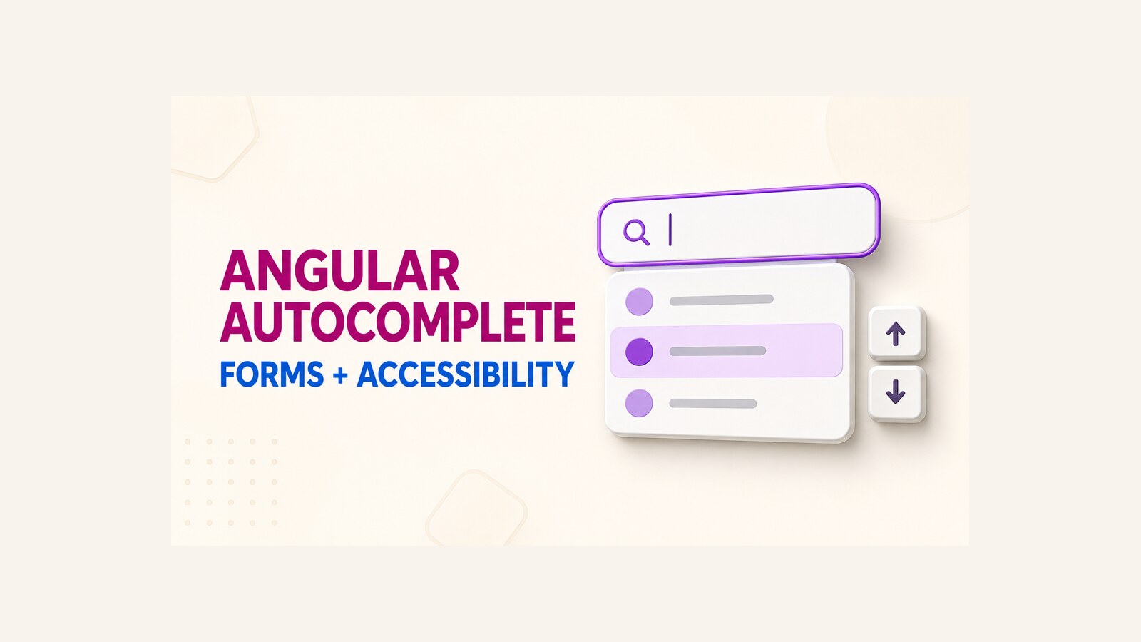
An Angular autocomplete select component becomes useful when a form needs both fast filtering and a controlled value contract. The visible text may be a department name, while the form stores only its ID; another screen may need the complete selected object. Angular’s ControlValueAccessor is the bridge that makes those cases behave like a normal form control.
This guide revisits the original DotNetCoder component from November 2024. The repository and demonstration were created with Angular CLI 18.2.11. They are preserved as historical working material, but they have not been retested against the current Angular release. The goal here is to explain the design accurately, show how to use it, and identify the form, accessibility, and production checks that matter before you adopt it.
Table of Contents
Define the component’s value contract first
An autocomplete has at least two values: the text displayed in the input and the value written to the form model. Confusing them is the source of many integration bugs.
displayPropertyselects the label shown to the user, such asname.bindingPropertyselects the scalar written to the form, such asidorcode.emitProperty="false"changes the contract so the complete object is written instead.itemSelectedis a separate event for consumers that need the selected object in addition to the form value.
Choose one contract for each use case and keep it stable. If a department control stores IDs, it should not sometimes emit a department object or a display label. That stability matters for typed forms, API payloads, validation, and reset behavior.
<dnc-autocomplete
  [items]="departments"
  formControlName="departmentId"
  displayProperty="name"
  bindingProperty="id" />
In the historical implementation, getSafeProperty converts values to strings. That makes filtering convenient, but it also means a numeric id can reach the form as a string. Confirm the actual runtime type before sending the form value to an API.
How the historical ControlValueAccessor works
Angular defines ControlValueAccessor as the interface between the Forms API and a UI control. The component registers itself through NG_VALUE_ACCESSOR, then implements the four operations a form control needs: receive a model value, report a user change, report a touched state, and accept a disabled state.
providers: [
  {
    provide: NG_VALUE_ACCESSOR,
    useExisting: forwardRef(() => DncAutocompleteComponent),
    multi: true
  }
]
The original component keeps the callbacks supplied by Angular and invokes onChange after a selection. Its writeValue method performs the reverse direction: it finds the matching item and restores the visible label when the parent form writes a value.
writeValue(value: any | null): void {
  let item;

  if (this.emitProperty) {
    item = this.items.find(item =>
      this.getSafeProperty(
        item,
        this.bindingProperty || this.displayProperty
      ) === String(value)
    );
  } else {
    item = this.items.find(i => i === value);
  }

  this.searchText = item
    ? this.getSafeProperty(item, this.displayProperty)
    : '';
}

registerOnChange(fn: (value: any | null) => void): void {
  this.onChange = fn;
}

registerOnTouched(fn: () => void): void {
  this.onTouched = fn;
}

setDisabledState(isDisabled: boolean): void {
  this.isDisabled = isDisabled;
}
The selection path writes either the configured property or the complete item. It also closes the result list and emits the selected item to the optional event consumer.
selectItem(item: any): void {
  const displayValue =
    this.getSafeProperty(item, this.displayProperty);
  const bindingValue =
    this.getSafeProperty(
      item,
      this.bindingProperty || this.displayProperty
    );

  this.searchText = displayValue;
  this.onChange(this.emitProperty ? bindingValue : item);
  this.itemSelected.emit(item);

  this.filteredItems = [];
  this.noResultsFound = false;
  this.activeIndex = -1;
}
This is the central design of the component. The form owns the model value; the autocomplete owns the interaction state; the accessor methods synchronize the two.
Use the component in Angular forms
The original demo covers three consumption modes. Reactive forms are the clearest choice when the selected value participates in a larger form model.
Reactive forms
<dnc-autocomplete
  [items]="languages"
  formControlName="language"
  displayProperty="name"
  bindingProperty="code"
  initialValue="en"
  (itemSelected)="onItemSelected($event)" />
Here the input shows a language name, while the form receives a language code. For production code, prefer setting the initial value in the FormControl itself. A form model should remain the single source of truth; an additional initialValue input creates another initialization path that must be synchronized with resets and later model updates.
Template-driven forms
<form #courseForm="ngForm">
  <dnc-autocomplete
    name="course"
    [(ngModel)]="selectedCourse"
    [items]="courses"
    displayProperty="name"
    bindingProperty="code"
    placeholderText="Select a course">
  </dnc-autocomplete>
</form>

<p>Selected course: {{ selectedCourse }}</p>
The same accessor supports ngModel. The important point is unchanged: the bound value is the configured course code, not the label rendered in the input.
Event-only usage
<dnc-autocomplete
  [items]="programs"
  displayProperty="name"
  (itemSelected)="onProgramSelected($event)"
  placeholderText="Select a program">
</dnc-autocomplete>
This can work for a small isolated interaction, although form integration gives you a clearer validation, reset, disabled, and submission lifecycle. If you are comparing reusable selection controls across UI frameworks, the same value-contract question appears in this reusable Blazor select component.
Treat accessibility as a separate contract
Arrow-key handling alone does not make a component accessible. The historical template supports ArrowDown, ArrowUp, and Enter, but it does not implement the complete WAI-ARIA combobox pattern. That distinction must be explicit.
onKeydown(event: KeyboardEvent): void {
  if (this.filteredItems.length === 0) {
    return;
  }

  if (event.key === 'ArrowDown') {
    this.activeIndex =
      (this.activeIndex + 1) % this.filteredItems.length;
    event.preventDefault();
  } else if (event.key === 'ArrowUp') {
    this.activeIndex =
      (this.activeIndex - 1 + this.filteredItems.length)
      % this.filteredItems.length;
    event.preventDefault();
  } else if (event.key === 'Enter' && this.activeIndex >= 0) {
    this.selectItem(this.filteredItems[this.activeIndex]);
  }
}
For an editable combobox with a list popup, the W3C pattern expects a named combobox, an associated listbox, an expanded state, a relationship to the popup, and an active option that assistive technology can follow. A production implementation should account for at least:
- A visible
<label>connected to the input, or an equivalent accessible name. role="combobox",aria-expanded,aria-controls, and the correctaria-autocompletevalue on the input.role="listbox"on the popup androle="option"with selection state on each result.aria-activedescendantwhen visual focus moves through the popup while DOM focus remains in the input.Escapebehavior that closes the popup without unexpectedly changing a committed selection.- A clear announcement for “No results” and predictable behavior when results change.
The accessor contract also requires touch handling. The original class stores onTouched, but its template does not call it on blur. As a result, validators and error messages that depend on the touched state may not behave like a native input.
Production risks in the original implementation
The repository remains useful as a compact demonstration, but several boundaries should be reviewed before production use.
- Disabled state:
setDisabledStateupdatesisDisabled, but the historical input markup does not bind that property to[disabled]. - Touched state: the registered touch callback is not invoked on blur.
- Validation: a
validate()method exists, but the component is not registered throughNG_VALIDATORSand does not declare theValidatorinterface. Do not assume Angular Forms will execute it. - Type conversion: property values are converted to strings, which can change numeric IDs in the form model.
- Initialization side effects:
setInitialItemcallsonChangeand emitsitemSelected. Initialization can therefore look like a user edit to subscribers. - Clearing: an empty search calls
resetSearch, which clears the form value and emitsnull. Confirm that deleting text should also discard the committed selection. - Large or remote lists: filtering runs synchronously over the complete in-memory array on every input event. Remote search needs debouncing, cancellation, loading state, error handling, and a request-size policy.
- Object identity: when
emitPropertyis false,writeValuesearches by reference equality. A reconstructed object with the same fields will not match the original item instance.
These are not reasons to discard the demonstration. They define the engineering work required to turn a compact example into a reusable application control.
Verification checklist
Run the following checks in the Angular version and browser matrix used by your application. The historical demo is evidence of its original behavior, not a substitute for current verification.
- Write a scalar value from the parent
FormControland confirm the matching label appears without emitting a false user-change event. - Select an item with the mouse and keyboard. Confirm the expected scalar or object reaches the form with the correct runtime type.
- Reset the parent form and confirm the input text, popup, active index, and selected value all return to the same empty state.
- Disable and re-enable the form control. Confirm the input is not interactive while disabled and exposes the disabled state correctly.
- Tab into and away from the control. Confirm the touched state changes only after the expected interaction.
- Use
ArrowDown,ArrowUp,Enter,Escape, and normal text-editing keys. Confirm the popup and committed value remain predictable. - Inspect the accessibility tree and test with a screen reader. Verify the label, expanded state, result count or status, active option, selected option, and no-results state.
- Test an empty list, duplicate labels, missing properties, delayed item loading, a value that is not present, and a list large enough to expose filtering cost.
- Run the project’s unit tests and a focused interaction test in the exact Angular version you plan to ship.
A component is ready when its value semantics, keyboard behavior, accessibility state, and failure paths are verified together. A visually correct dropdown is only one part of that contract.
Historical demo and compatibility boundary
The video below shows the original Angular 18.2.11 demonstration recorded in November 2024. It illustrates filtering, selection, reactive forms, template-driven forms, and standalone event usage as they behaved in that project at the time.
The original Angular 18.2.11 demonstration recorded in November 2024.
Angular’s documentation currently identifies a newer framework release than the repository’s Angular 18.2.11 baseline. No current-compatibility claim is made here because this historical project was not rebuilt and tested during this editorial update. If you adopt it, use the checklist above in your own supported version.
References
- Angular API: ControlValueAccessor
- Angular API: NG_VALUE_ACCESSOR
- Angular guide: Reactive forms
- Angular guide: Strictly typed reactive forms
- W3C WAI-ARIA Authoring Practices: Combobox pattern
Demo source: Angular autocomplete select component on GitHub.
Found this useful? Support more practical developer content.