

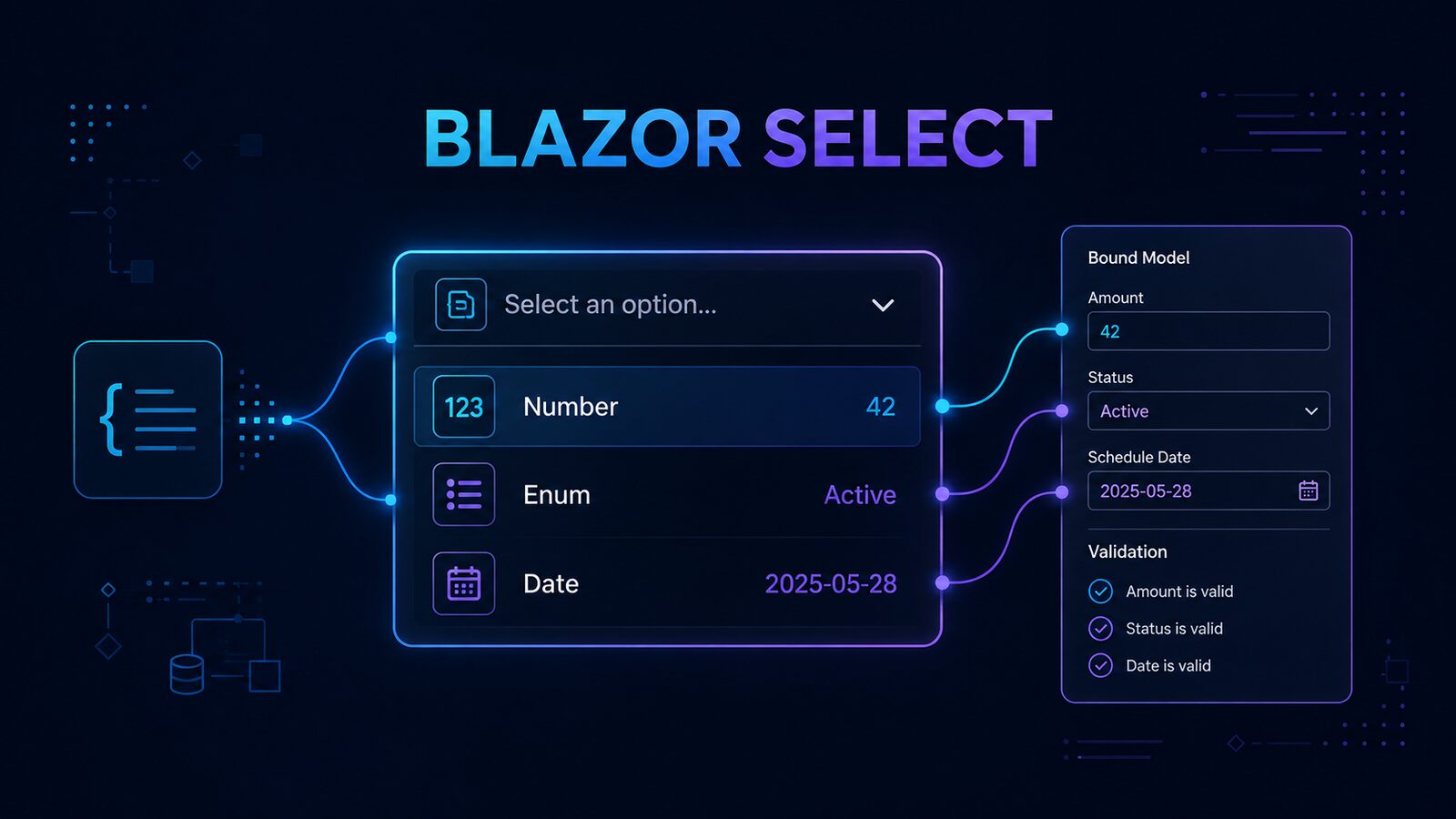
A reusable Blazor select component can keep typed values, parsing, and form validation behind one familiar HTML control. The original example in this guide wraps a native <select> with InputBase<TValue>, supplies generic option components, and converts string values into numbers, enums, and dates.
Historical example: this article and its repository were created with .NET 8 in July 2024. The original code is preserved below because it was working when the demo was recorded. This refresh improves the explanation and production guidance; it does not claim that the sample was rebuilt or retested on a newer .NET release. Check the current .NET support policy and test the repository in your target environment before adopting it.
Table of Contents
Table of Contents
Why Build a Reusable Blazor Select Component?
Blazor already includes InputSelect<TValue>, so a custom component should solve a concrete project need rather than duplicate framework behavior. The original component is useful as a compact learning example: it shows how a form control can inherit from InputBase<TValue>, participate in an EditForm, accept child content, and centralize conversion.
This design differs from the earlier Blazor dropdown list component. That article focuses on rendering a list of choices. This one focuses on a typed form input whose selected string must become the model’s TValue and whose conversion failure can enter Blazor’s validation flow.
- Use the native
<select>element and retain its browser keyboard behavior. - Bind the selected value to an
int, enum,DateTime, or another supported type. - Allow a caller-supplied converter when the shared conversion policy is insufficient.
- Keep option markup composable through
RenderFragment.
How the Original Design Works
The solution contains a Razor class library named Dnc.Common.Razor and a Blazor Web App named Dnc.Select.WebApp. The reusable library exposes two components and one converter:
DncSelect<TValue>renders the native select and connects it toInputBase<TValue>.DncOption<TValue>renders each option and accepts either child text or the value itself.DncConvertertranslates the browser’s string value into the requested CLR type.
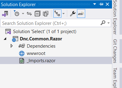
Create a blank solution named Select, then add the Razor class library and target .NET 8 to match the historical repository. If you use a current SDK, treat any compiler or behavior change as migration work and validate it independently instead of assuming compatibility.
Create the DncSelect Component
Inside the class library, create a Select folder and add DncSelect.razor. The following is the original component code, unchanged:
@using System.Diagnostics.CodeAnalysis
@using System.Linq.Expressions
@using System.Globalization
@using Microsoft.AspNetCore.Components.Forms
@inherits InputBase<TValue>
@typeparam TValue

<select class="form-select" @bind="SelectedValue">
    @ChildContent
</select>

@code {

    [Parameter]
    public RenderFragment ChildContent { get; set; }

    [Parameter]
    public Func<string, TValue> TypeConverter { get; set; }

    [Parameter]
    public CultureInfo CultureInfo { get; set; }

    public string SelectedValue
    {
        get { return CurrentValueAsString; }
        set { CurrentValueAsString = value; }
    }

    protected override bool TryParseValueFromString(string value,
        [MaybeNullWhen(false)] out TValue result, [NotNullWhen(false)] out string validationErrorMessage)
    {
        try
        {
            if (TypeConverter != null)
            {
                result = TypeConverter(value);
            }
            else
            {
                if (CultureInfo != null)
                {
                    result = DncConverter.ChangeType<TValue>(value, CultureInfo);
                }
                else
                {
                    result = DncConverter.ChangeType<TValue>(value);
                }
            }

            validationErrorMessage = null;
            return true;
        }
        catch (Exception ex)
        {
            result = default(TValue);
            validationErrorMessage = ex.Message;
            return false;
        }
    }
}
CurrentValueAsString is the bridge between the browser’s option value and Blazor’s typed model value. Assigning the bound string invokes TryParseValueFromString. A successful conversion updates the component value; a failed conversion returns a validation message. This follows the purpose of Blazor’s input base class, although the current framework also provides built-in inputs with parsing and validation behavior. See Microsoft’s current Blazor input component guidance.
The optional TypeConverter parameter gives the parent full control over one field’s parsing. Without it, the component delegates to DncConverter. That fallback keeps common conversions in one place, but the caller must still decide which cultures, formats, and invalid values are acceptable in its domain.
Convert String Values to TValue
Add DncConverter.cs in the same folder. This is the original converter:
namespace Dnc.Common.Razor.Select
{
    public static class DncConverter
    {
        public static TValue ChangeType<TValue>(string value, CultureInfo cultureInfo)
        {
            if (string.IsNullOrEmpty(value))
            {
                return default;
            }

            Type targetType = typeof(TValue);

            try
            {
                if (targetType == typeof(string))
                {
                    return (TValue)(object)value;
                }

                if (targetType == typeof(Guid))
                {
                    return (TValue)(object)new Guid(value);
                }

                if (Nullable.GetUnderlyingType(targetType) is Type underlyingType)
                {
                    targetType = underlyingType;
                }

                if (targetType == typeof(DateTime))
                {
                    return (TValue)(object)DateTime.Parse(value, cultureInfo);
                }

                if (targetType == typeof(bool))
                {
                    return (TValue)(object)bool.Parse(value);
                }

                if (targetType.IsEnum)
                {
                    return (TValue)Enum.Parse(targetType, value);
                }

                if (targetType.IsValueType || targetType.IsPrimitive)
                {
                    return (TValue)Convert.ChangeType(value, targetType, cultureInfo);
                }

                throw new InvalidCastException($"Cannot convert '{value}' to {targetType.Name}.");
            }
            catch (Exception ex)
            {
                throw new InvalidCastException($"Cannot convert '{value}' to {targetType.Name}.", ex);
            }
        }

        public static TValue ChangeType<TValue>(string value)
        {
            return ChangeType<TValue>(value, CultureInfo.CurrentCulture);
        }
    }
}
The order is intentional: strings and GUIDs receive direct handling, nullable wrappers are unwrapped, dates use the supplied culture, enums use Enum.Parse, and remaining primitive or value types use Convert.ChangeType. Empty input returns the default value.
For production use, define a stricter parsing contract. DateTime.Parse accepts multiple shapes, enum parsing is case-sensitive in this version, and returning default for an empty string can make “no selection” indistinguishable from valid values such as 0 or the first enum member. A nullable model property or a deliberately empty sentinel value is usually clearer.
Create the DncOption Component
Add DncOption.razor. The component renders child content when supplied and otherwise displays the value:
@typeparam TValue

<option value="@Value" disabled="@Disabled" selected="@IsDefaultOption">

    @if (ChildContent != null)
    {
        @ChildContent
    }
    else
    {
        @Value
    }
</option>

@code {
    [Parameter]
    public TValue Value { get; set; }

    [Parameter]
    public RenderFragment ChildContent { get; set; }

    [Parameter]
    public bool IsDefaultOption { get; set; }

    [Parameter]
    public bool Disabled { get; set; }
}
Disabled maps directly to the native option state. IsDefaultOption emits the HTML selected attribute, but remember that Blazor binding also controls the select’s current value. In a hardened revision, prefer one source of truth: initialize the bound model value and let binding determine the selected option.
Use the Component in a Blazor Form
Add a Blazor Web App named Dnc.Select.WebApp, reference the class library, and import its namespace. The historical sample also loads Bootstrap 5.3.3 for styling. The following original page binds three different types:
@page "/"
@using System.Text.Json
@using System.ComponentModel.DataAnnotations
@using System.Globalization

<PageTitle>Home</PageTitle>

<div class="container">
    <p class=" alert alert-info my-3">@JsonSerializer.Serialize(MyEmployee);</p>

    <EditForm Model="@MyEmployee" OnValidSubmit="HandleValidSubmit">

        <label class="form-label my-3">Age</label>

        <DncSelect @bind-Value="@MyEmployee.Age" TypeConverter="@((v) => int.Parse(v))">
            <DncOption Value="default(int)" IsDefaultOption>Select Age</DncOption>
            <DncOption Value="30" />
            <DncOption Value="40" />
            <DncOption Value="50" Disabled />
        </DncSelect>

        <label class="form-label my-3">Gender</label>

        <DncSelect @bind-Value="@MyEmployee.Gender" TypeConverter="@(v=> Enum.Parse<Gender>(v))">
            <DncOption Value="default(Gender)" IsDefaultOption="true">Select Gender</DncOption>
            <DncOption Value="@Gender.Male" />
            <DncOption Value="@Gender.Female" />
        </DncSelect>

        <label class="form-label my-3">Contract Expiration</label>

        <DncSelect @bind-Value="@MyEmployee.ContractTill" CultureInfo="@(new CultureInfo("en-IE"))">
            <DncOption Value="default(DateTime)" IsDefaultOption="true">Select Contract Expiration</DncOption>
            <DncOption Value="@(new DateTime(2030, 7,7))">
                @(new DateTime(2030, 7, 7).ToString("yyyy-mm-dd"))
            </DncOption>
            <DncOption Value="@(new DateTime(2035, 7,7))">
                @(new DateTime(2035, 7, 7).ToString("yyyy-mm-dd"))
            </DncOption>
        </DncSelect>

        <div class="form-group my-5">
            <button class="btn btn-primary">Submit</button>
        </div>
    </EditForm>
</div>

@code{
    public Employee MyEmployee {get; set;}

    protected override void OnInitialized()
    {
        MyEmployee = new Employee
        {
            Name = "Net Coder",
        };
    }

    public void HandleValidSubmit()
    {
        // insert it to the database
    }

    public class Employee {
        public string Name { get; set; }
        public int Age { get; set; }
        public Gender Gender { get; set; }
        public DateTime ContractTill { get; set; }
    }

    public enum Gender {
        Male,
        Female
    }
}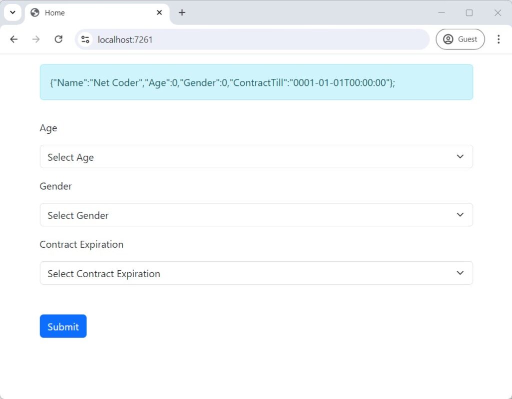
The page demonstrates caller-supplied parsing for age and gender, plus culture-aware fallback conversion for the contract date. In a current Blazor Web App, the page or an ancestor must use an interactive render mode for change events and binding to run. Microsoft documents that static server-side rendering alone is not interactive; verify the app’s render-mode configuration.
Production Limitations and Hardening
The sample explains the mechanics, but a production component needs an explicit contract. Review these points before reuse:
- Prefer the built-in component when it fits. Start with
InputSelect<TValue>. Maintain custom parsing code only when the application genuinely needs it. - Preserve arbitrary attributes. The original component hard-codes
class="form-select"and doesn’t capture unmatched attributes, so callers can’t naturally add anid,aria-describedby, or additional classes. - Associate every label. The visible labels in the historical page don’t have
forattributes tied to select IDs. W3C recommends an explicit label whoseforvalue exactly matches the control’sid. - Use nullable values for “not selected.” A placeholder backed by
0, the first enum member, orDateTime.MinValuemay look unselected while the model contains a valid default. - Control parsing and messages. Catching every exception and exposing
ex.Messagecan leak implementation detail and produce inconsistent user-facing text. Return a stable, field-specific validation message. - Test culture boundaries. The option value’s serialized form and the parser’s culture must agree. Test at least the cultures deployed in production, especially for dates and decimals.
- Avoid duplicate selection state. Do not let
selectedmarkup and the bound model disagree. Initialize the model and let one binding path own the state. - Use a different control for search-scale data. A native select is a good fit for a modest, known set of options. Large or remote datasets need an accessible search/combobox pattern, cancellation, loading feedback, and error handling.
Native select controls already provide valuable browser and keyboard behavior. Retaining them is often safer than replacing them with a visually similar collection of div elements. For accessible forms, follow the W3C guidance for labeling controls and test with a keyboard and assistive technology.
Verify the Implementation
Do not stop after the component renders. Use a short verification matrix:
- Bind a valid number, enum, date, nullable value, and string; confirm the model receives the expected CLR value.
- Submit an empty placeholder and an invalid value; confirm validation prevents an invalid model from being accepted.
- Run the page under each render mode you support and confirm the select becomes interactive.
- Switch the test culture and verify date and numeric round trips.
- Tab to the select, change the option with the keyboard, and confirm the visible label is announced correctly.
- Initialize the model with a non-default option and confirm only that option is selected.
- Test a disabled option and confirm it can’t become the bound value through ordinary interaction.
The original recording below demonstrates the .NET 8 implementation. It is historical evidence of the original result, not proof of compatibility with later SDKs.
Sample Code and Next Steps
The complete historical .NET 8 sample is available in the Blazor select component repository. Clone it when you want to study the exact implementation, then add your own build, validation, culture, accessibility, and render-mode checks before using it in a maintained application.
The main design lesson is not that every select needs a wrapper. It is that a shared component must own a clear responsibility. Here, that responsibility is converting the browser’s string selection into a typed model value while cooperating with Blazor forms. When the built-in InputSelect<TValue> already satisfies that requirement, use it. When your domain needs a stricter conversion contract, centralize that contract and verify every failure path.
Found this useful? Support more practical developer content.