

A reusable Blazor dropdown component can keep a menu trigger, item templates, selected styling, and selection callbacks in one place. The original .NET 8 sample in this guide builds that behavior from four generic Razor components and supports countries, strings, and enum values without duplicating the menu structure.
Important distinction: this is a custom action-style dropdown menu rendered with a button and div items. It is not a native HTML <select>, and it does not integrate with EditForm validation. For a typed form input, use the Blazor select component with binding and validation instead.
Version note: The repository, screenshots, and video were created with .NET 8 in June 2024. The original code remains unchanged below. This refresh rewrites the explanation and adds production, accessibility, and compatibility guidance; it does not claim that the historical project was rebuilt or tested on a newer framework.
Download or inspect the complete sample in the original Blazor dropdown component repository.
Table of Contents
How the Blazor Dropdown Component Works
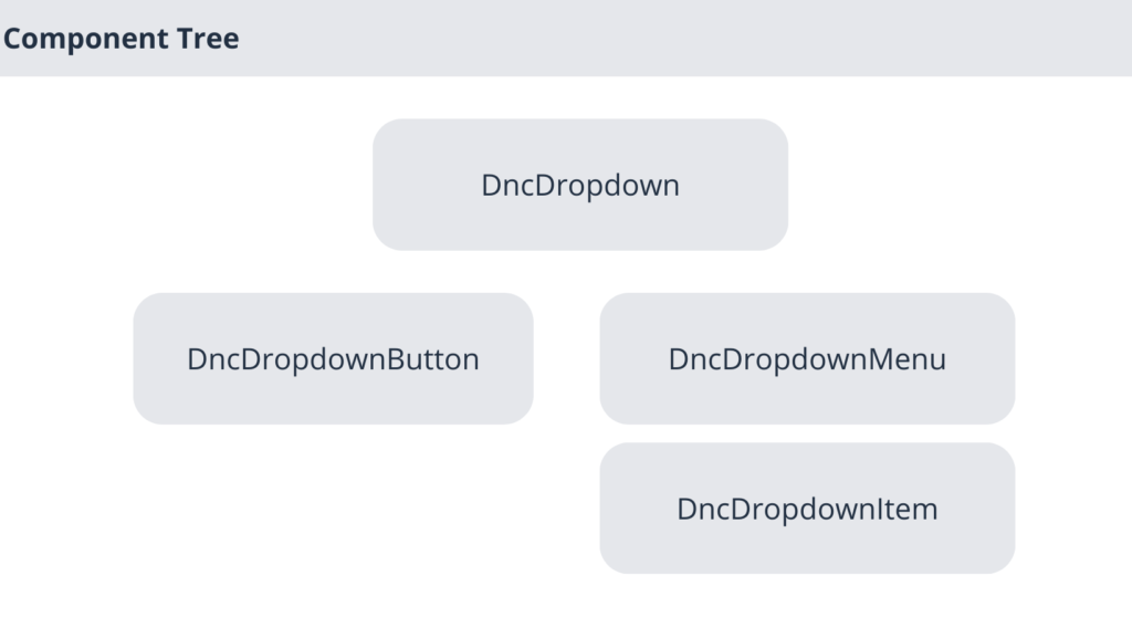
The sample separates the dropdown into four responsibilities. DncDropdown<TItem> owns open state and the selection callback. DncDropdownButton<TItem> toggles the menu. DncDropdownMenu<TItem> conditionally renders the item container. DncDropdownItem<TItem, TValue> extracts a value, renders an optional template, and tells the parent which item was selected.
The parent component flows itself to descendants through CascadingValue. That avoids passing the same state and methods through every intermediate component. The design is useful when menu items need rich markup, but it also creates a tight relationship between the four components: the child components only work inside a matching DncDropdown<TItem>.
Create the Solution and Razor Class Library
The original solution contains a Razor class library named Dnc.Common.Razor and a Blazor Web App named Dnc.Dropdown.WebApp, both targeting net8.0. Create a Dropdown folder in the class library for the four reusable components, then reference that library from the web app.
Because opening the menu and selecting an item depend on @onclick, the component must run in an interactive render mode. If it renders but does not respond, verify the app’s render-mode configuration before changing the component code.
Build the Parent Dropdown Component
Create DncDropdown.razor. The following is the original implementation:
@typeparam TItem
<CascadingValue Value="@this">
    <div class="dropdown">
        @ChildContent
    </div>
</CascadingValue>

@code {
    [Parameter]
    public RenderFragment ChildContent { get; set; }

    [Parameter]
    public EventCallback<TItem> OnSelected { get; set; }

    public bool Show { get; private set; }

    private object selectedValue;

    public object SelectedValue {
        get { return this.selectedValue; }
        set
        {
            this.selectedValue = value;
            StateHasChanged();
        }
    }

    public void Toggle()
    {
        Show = !Show;
        StateHasChanged();
    }

    public async Task HandleSelect(TItem item, object selectedValue)
    {
        this.SelectedValue = selectedValue;
        Show = false;
        StateHasChanged();
        await this.OnSelected.InvokeAsync(item);
    }
}
ChildContent receives the nested button and menu. OnSelected sends the complete selected item to the consuming page. Toggle changes visibility, while HandleSelect stores the extracted value, closes the menu, and awaits the callback.
The explicit StateHasChanged() calls are preserved. Blazor normally rerenders automatically after its event handlers, so several calls are redundant in this implementation. They are not proof of a bug, but a production refactor should remove unnecessary renders only after behavior tests are in place.
Add the Button and Menu Components
Create DncDropdownButton.razor. It receives the parent through a cascading parameter and calls Toggle when clicked.
@typeparam TItem

<button class="btn btn-primary" @onclick="HandleClick" type="button"
        id="dropdownMenuButton" data-toggle="dropdown"
        aria-haspopup="true" aria-expanded="false">
    @ChildContent
</button>

@code {
    [CascadingParameter]
    public DncDropdown<TItem> DncDropdown { get; set; }

    [Parameter]
    public RenderFragment ChildContent { get; set; }

    private void HandleClick()
    {
        this.DncDropdown.Toggle();
    }
}
Next create DncDropdownMenu.razor. It adds the Bootstrap show class only when the parent state is open.
@typeparam TItem

@if (DncDropdown.Show)
{
    <div class="dropdown-menu show" aria-labelledby="dropdownMenuButton">
        @ChildContent
    </div>
}

@code {
    [CascadingParameter]
    public DncDropdown<TItem> DncDropdown { get; set; }

    [Parameter]
    public RenderFragment ChildContent { get; set; }
}
The visibility is controlled by Blazor, not by Bootstrap JavaScript. The historical data-toggle attribute therefore does not control this menu. Production code should either remove unused Bootstrap behavior attributes or deliberately integrate the matching Bootstrap version.
Build the Generic Dropdown Item
DncDropdownItem accepts an item and an expression that selects its comparison value. A typed RenderFragment<TItem> lets each caller decide how the row should look.
@using System.Linq.Expressions
@typeparam TItem
@typeparam TValue

<div class="dropdown-item @CssSelected @isDisabled"
     data-value="@ItemValue" Item="@Item"
     @onclick="e=> DncDropdown.HandleSelect(Item, ItemValue)">
    @if (HasChild)
    {
        @ChildContent(Item)
    }
    else
    {
        @ItemValue
    }
</div>

@code {
    [CascadingParameter]
    public DncDropdown<TItem> DncDropdown { get; set; }

    [Parameter]
    public RenderFragment<TItem> ChildContent { get; set; }

    [Parameter]
    public TItem Item { get; set; }

    [Parameter]
    public Expression<Func<TItem, TValue>> Value { get; set; }

    [Parameter]
    public bool Selected { get; set; }

    [Parameter]
    public bool Disabled { get; set; }

    private bool HasChild => ChildContent != null;
    private string isDisabled => Disabled ? "disabled" : "";
    private object ItemValue => GetValue(Value);

    private string CssSelected
    {
        get
        {
            if (DncDropdown.SelectedValue == null && Selected)
            {
                return "selected";
            }
            else
            {
                return ItemValue?.ToString() ==
                       DncDropdown.SelectedValue?.ToString()
                    ? "selected" : "";
            }
        }
    }

    private object GetValue(Expression<Func<TItem, TValue>> expression)
    {
        var compiledExpression = expression.Compile();
        try
        {
            return compiledExpression(Item);
        }
        catch
        {
            return null;
        }
    }
}
The original CSS supplies selected and disabled appearances:
.selected {
    color: #fff;
    background-color: #0d6efd;
}

.disabled {
    pointer-events: none;
    opacity: 0.9;
}

.dropdown-item {
    width: 100%;
}

.dropdown-item:active {
    background-color: #80aded;
}
This works visually for the demonstration, but CSS does not create disabled semantics for a div. The limitations section explains what must change before using this pattern as an accessible production control.
Use the Dropdown in a Blazor Page
Reference the class library, import Dnc.Common.Razor.Dropdown, and then compose the four components. This preserved example renders countries and sends the selected Country object to the page:
<DncDropdown TItem="Country" OnSelected="@HandleSelectedLanguage">
    <DncDropdownButton TItem="Country">
        <i class="fas fa-language"></i> Language Settings
    </DncDropdownButton>
    <DncDropdownMenu TItem="Country">
        @foreach (var country in countries)
        {
            <DncDropdownItem Item="@country"
                             Value="(Country v) => v.Language">
                <div class="dnc-div">
                    @context.Name
                    <span class="dnc-span">@context.Language</span>
                </div>
            </DncDropdownItem>
        }
    </DncDropdownMenu>
</DncDropdown>

@code {
    private string selectedLanguageSetting = string.Empty;

    private readonly List<Country> countries = new()
    {
        new Country { Name = "USA", Language = "EN" },
        new Country { Name = "France", Language = "FR" },
        new Country { Name = "Egypt", Language = "AR" }
    };

    private void HandleSelectedLanguage(Country value)
    {
        selectedLanguageSetting = value?.Language;
    }

    public class Country
    {
        public string Name { get; set; }
        public string Language { get; set; }
    }
}
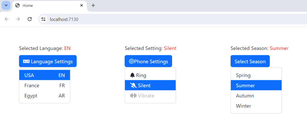
The repository also demonstrates a string menu with one preselected item and one disabled item, plus an enum menu for seasons. Those examples show that TItem is not limited to one model type.
Verify the Original Behavior
Run the original app and verify each behavior instead of checking only the final appearance:
- Each button opens and closes only its own menu.
- Selecting an enabled item closes the menu and invokes the correct callback once.
- The chosen row receives the selected style.
- The initially selected phone setting is highlighted before a new choice.
- The disabled demonstration item does not respond to a pointer click.
- Country, string, and enum items display the expected values.
Production and Accessibility Limitations
The sample explains component composition, but it is not a complete accessible menu or listbox. Decide what interaction you are building before extending it. A menu of actions, a listbox that selects a value, and a form select have different semantic and keyboard requirements.
- Use semantic controls. Clickable
divelements are not keyboard-operable by default. Menu items need appropriate roles, focusability, keyboard handling, and disabled state. A form value should normally useInputSelector a customInputBase<TValue>component. - Synchronize ARIA state. The original button hard-codes
aria-expanded="false". It should reflectShow. The repeateddropdownMenuButtonID must also become unique for every instance. - Manage focus. Opening should move focus according to the chosen interaction pattern. Support arrow keys where appropriate, Escape to close, and a defined focus return to the trigger.
- Handle outside interaction. The sample does not close when the user clicks elsewhere. Add outside-click behavior deliberately and test it with nested interactive content.
- Keep values typed.
object SelectedValueandToString()comparison lose type safety and can mark different values as equal. Prefer a typed value and an equality comparer. - Avoid repeated expression compilation.
Expression.Compile()can run repeatedly as properties are evaluated. A simpleFunc<TItem, TValue>or a cached compiled delegate is clearer unless the expression tree itself is required. - Do not hide failures. Catching every exception and returning
nullmakes configuration errors hard to diagnose. Validate required parameters and fail with a useful message. - Protect asynchronous selections. If
OnSelectedstarts slow work, consider a busy state, duplicate-click prevention, cancellation, and visible error handling.
These are not claims that the historical demo failed. They define the gap between a working visual sample and a reusable production component that supports keyboard users, assistive technology, multiple instances, and asynchronous application work.
Current Compatibility Status
The repository targets .NET 8, which remains supported until November 10, 2026. .NET 10 is the current LTS release, but this article does not present an unverified upgrade. If you move the project to a newer target framework, rebuild it, run the interaction checklist above, verify the render mode, and retest any Bootstrap or icon-library dependencies.
Conclusion
The original Blazor dropdown component is a compact example of generic Razor components, cascading parent state, templated content, and EventCallback<TItem>. It is suitable for learning how a component family collaborates and for controlled menu-style interfaces. Before production use, choose the correct semantics, implement keyboard and focus behavior, use unique IDs, keep selection typed, and test asynchronous callbacks.
Official References
- ASP.NET Core Blazor render modes
- ASP.NET Core Blazor event handling
- ASP.NET Core Blazor data binding
- ASP.NET Core Blazor input components
- ASP.NET Core Blazor rendering performance
- Official .NET support policy
Found this useful? Support more practical developer content.