

A reusable Blazor confirm dialog component gives destructive or high-impact actions a consistent confirmation step without duplicating dialog markup across pages. This guide preserves the original .NET 8 implementation and explains how its component parameters, callbacks, and Bootstrap-based UI work, then adds the production checks that matter before you adopt it.
Version note: The repository and screenshots were created with .NET 8 in May 2024. The original code remains unchanged. This refresh improves the explanation and documents current compatibility and accessibility risks; it does not claim that the project was rebuilt or verified on a newer framework.
You can inspect every file in the original Blazor confirm dialog repository. Use it as the source of truth for the historical sample.
Table of Contents
What the Confirm Component Owns
The component owns the repeated confirmation behavior: visibility, the dialog shell, the Cancel and OK actions, and the callback to the parent. The parent owns the business decision. It decides which record is being changed and performs the actual delete, block, or other operation only after confirmation.
Four RenderFragment parameters allow the calling page to replace the header, message, OK label, and Cancel label. This is intentionally smaller than the more general reusable Blazor modal component, which supports typed body content and form workflows. Use a confirm dialog for a focused yes-or-no decision; use the general modal when the user must edit or submit data.
Project Structure and Runtime Requirements
The original solution contains a Razor class library named Dnc.Common.Razor and a Blazor Web App named Dnc.Confirm.WebApp. Both target net8.0. The class library contains the reusable component, while the web app demonstrates two callers: one for deleting an account and another for blocking it.
Click handlers and EventCallback only run when the component uses an interactive render mode. The original app applies InteractiveServer to its root components. If the dialog renders but the buttons do nothing, verify the render-mode configuration before debugging the component.
The sample also loads Bootstrap 5.3.2. The component relies on Bootstrap classes for layout, but it controls visibility through Blazor state rather than Bootstrap’s JavaScript modal API.
Build the Component State and Callback Contract
Create Dnc.Common.Razor/Confirm/DncConfirmComponent.cs. The following code is preserved from the original repository:
using Microsoft.AspNetCore.Components;

namespace Dnc.Common.Razor.Confirm
{
    public class DncConfirmComponent : ComponentBase
    {
        [Parameter] public RenderFragment HeaderTemplate { get; set; }
        [Parameter] public RenderFragment BodyTemplate { get; set; }
        [Parameter] public RenderFragment OkTemplate { get; set; }
        [Parameter] public RenderFragment CancelTemplate { get; set; }
        [Parameter] public bool Scrollable { get; set; }
        [Parameter] public EventCallback<bool> OnOk { get; set; }

        protected bool Visible { get; set; }

        public void Display()
        {
            Visible = true;
            StateHasChanged();
        }

        protected void Cancel()
        {
            Visible = false;
        }

        protected async Task Ok()
        {
            Visible = false;
            await OnOk.InvokeAsync(true);
        }
    }
}
Display makes the dialog visible. Cancel closes it without invoking the parent callback. Ok closes it first and then awaits OnOk, allowing the parent to run its operation asynchronously.
The explicit StateHasChanged() call is part of the historical implementation. Current Blazor event handlers normally trigger rendering automatically. Here, however, Display is a public method invoked through a component reference, so retaining the explicit call makes the original intent clear.
Render the Confirmation Dialog
Create Dnc.Common.Razor/Confirm/DncConfirm.razor. It inherits the state and callbacks from the base class and renders only when Visible is true.
@inherits DncConfirmComponent

@if (Visible)
{
    <div class="modal fade show confirm-background"
         id="DncConfirm"
         style="display: block;"
         aria-modal="true"
         role="dialog">
        <div class="modal-dialog @(Scrollable ? " modal-dialog-scrollable" : "")">
            <div class="modal-content">
                <div class="modal-header">
                    @if (HeaderTemplate == null)
                    {
                        <h5 class="modal-title" id="exampleModalLabel">Confirm title</h5>
                    }
                    else
                    {
                        <h5>@HeaderTemplate</h5>
                    }
                    <button type="button" class="btn-close"
                            data-bs-dismiss="modal" aria-label="Close"
                            @onclick="@Cancel"></button>
                </div>
                <div class="modal-body">
                    @if (BodyTemplate == null)
                    {
                        <p>You're reading the default text in a confirmation body!</p>
                    }
                    else
                    {
                        <p>@BodyTemplate</p>
                    }
                </div>
                <div class="modal-footer">
                    <button type="button" class="btn btn-secondary confirm-button"
                            data-bs-dismiss="modal" @onclick="@Cancel">
                        @if (CancelTemplate == null)
                        {
                            <span>Cancel</span>
                        }
                        else
                        {
                            @CancelTemplate
                        }
                    </button>
                    <button type="button" class="btn btn-primary confirm-button"
                            @onclick="@Ok">
                        @if (OkTemplate == null)
                        {
                            <span>Ok</span>
                        }
                        else
                        {
                            @OkTemplate
                        }
                    </button>
                </div>
            </div>
        </div>
    </div>
}
The markup uses role="dialog" and aria-modal="true", but those attributes alone do not make a modal accessible. The production section below explains the missing interaction requirements.
Add the Isolated Component Styles
Add DncConfirm.razor.css beside the component:
.modal-dialog {
    margin-top: 7rem;
}

.confirm-background {
    background-color: rgba(0, 0, 0, 0.4);
    backdrop-filter: blur(15px);
}

.confirm-button {
    min-width: 6rem;
}
Because this is a scoped CSS file, the generated selectors apply to the component markup without becoming global application styles. Test the fixed top margin on short mobile screens and with browser zoom; a centered or responsive layout may be safer for production.
Use the Dialog from a Blazor Page
Import the component namespace, keep a component reference, and store the account ID before opening the dialog. The confirmation callback performs the operation only after the user selects OK.
@using Dnc.Common.Razor.Confirm

<button class="btn btn-danger"
        @onclick="() => ShowDeleteAccount(account.Id)">
    Delete account
</button>

<DncConfirm @ref="ConfirmDeleteAccount"
            OnOk="() => DeleteAccount()">
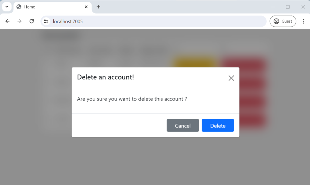
    <HeaderTemplate>Delete an account!</HeaderTemplate>
    <BodyTemplate>Are you sure you want to delete this account?</BodyTemplate>
    <OkTemplate>Delete</OkTemplate>
</DncConfirm>

@code {
    public DncConfirm ConfirmDeleteAccount { get; set; }
    private int AccountId { get; set; }

    protected void ShowDeleteAccount(int id)
    {
        AccountId = id;
        ConfirmDeleteAccount.Display();
    }

    protected void DeleteAccount()
    {
        var account = Accounts.FirstOrDefault(v => v.Id == AccountId);

        if (account != null)
        {
            Accounts.Remove(account);
        }
    }
}
The repository also shows a separate dialog reference for blocking an account. Separate instances make the templates clear, but a production API may instead accept a message and return a confirmation result so one dialog can serve several actions.
Verify the Original Behavior
The repository and original screenshots document the May 2024 implementation. When reproducing that environment, verify the complete user task:
- Start the app and confirm that the account table appears.
- Select Delete account and confirm that the delete-specific header, message, and button label appear.
- Select Cancel and verify that the account remains unchanged.
- Open the dialog again, select Delete, and verify that only the selected account is removed.
- Open the block dialog, select Block, and verify that the selected account changes to the blocked state.
- Confirm that each action affects the ID captured before its dialog opened.
This refresh does not claim a new execution on .NET 10. If you run the historical repository with another SDK, record the SDK version, render mode, browser, console output, and exact failing step instead of treating a successful page load as full verification.
Production Risks and Safer Design Choices
Accessibility and keyboard control
A production modal must move focus into the dialog, keep Tab and Shift+Tab inside it, support Escape, and return focus to the control that opened it. The dialog also needs an accessible name linked with aria-labelledby. The original component does not visibly implement this complete focus model.
For a short destructive confirmation, evaluate whether role="alertdialog" better communicates the interruption than a general dialog. Follow the WAI-ARIA pattern, but remember that ARIA describes semantics; it does not implement focus trapping or keyboard behavior for you.
Repeated clicks and asynchronous work
The original dialog closes before awaiting the callback. In a real application, decide how to prevent duplicate submissions, show progress, handle a failed delete, and restore a useful state. Disabling the confirmation button while an operation is running is safer than allowing repeated clicks.
Authorization and concurrency
A confirmation dialog is only a client-side safety step. The server must still authorize the operation and verify that the target exists and is in a valid state. Pass a stable identifier to the backend and handle conflicts when another user changes or deletes the record while the dialog is open.
Component API design
EventCallback<bool> always receives true because Cancel never invokes it. That works, but the Boolean adds little information. A later design could expose separate callbacks or an asynchronous API that returns a result. Any modernization should be versioned deliberately because changing the public component contract affects callers.
Current Compatibility Status
As of September 1, 2026, .NET 10 is the active LTS release. The original project targets .NET 8, which reaches end of support on November 10, 2026. The core Blazor concepts used here remain current: Razor components still expose parameters, EventCallback still communicates with a parent, event handlers still trigger rendering, and interactive render modes are still required for UI events in Blazor Web Apps.
That architectural continuity does not prove that this repository builds unchanged on .NET 10. This refresh did not update target frameworks, packages, or source files and did not execute a newer build. Treat newer-framework compatibility as unverified until the solution is upgraded and the confirmation workflow is tested.
Conclusion
The original Blazor confirm dialog component demonstrates a useful separation: the component controls presentation and confirmation state, while the parent controls the target and business operation. That makes the dialog reusable without hiding application logic inside a UI component.
Use the repository to understand the verified .NET 8 sample. Before production adoption, complete the keyboard and focus model, guard asynchronous operations against duplicate execution, enforce authorization on the server, and test the project on your actual framework target.
Official References
- ASP.NET Core Razor components
- ASP.NET Core Blazor event handling
- ASP.NET Core Blazor render modes
- .NET support policy
- WAI-ARIA modal dialog pattern
- WAI-ARIA alert dialog pattern
Found this useful? Support more practical developer content.