
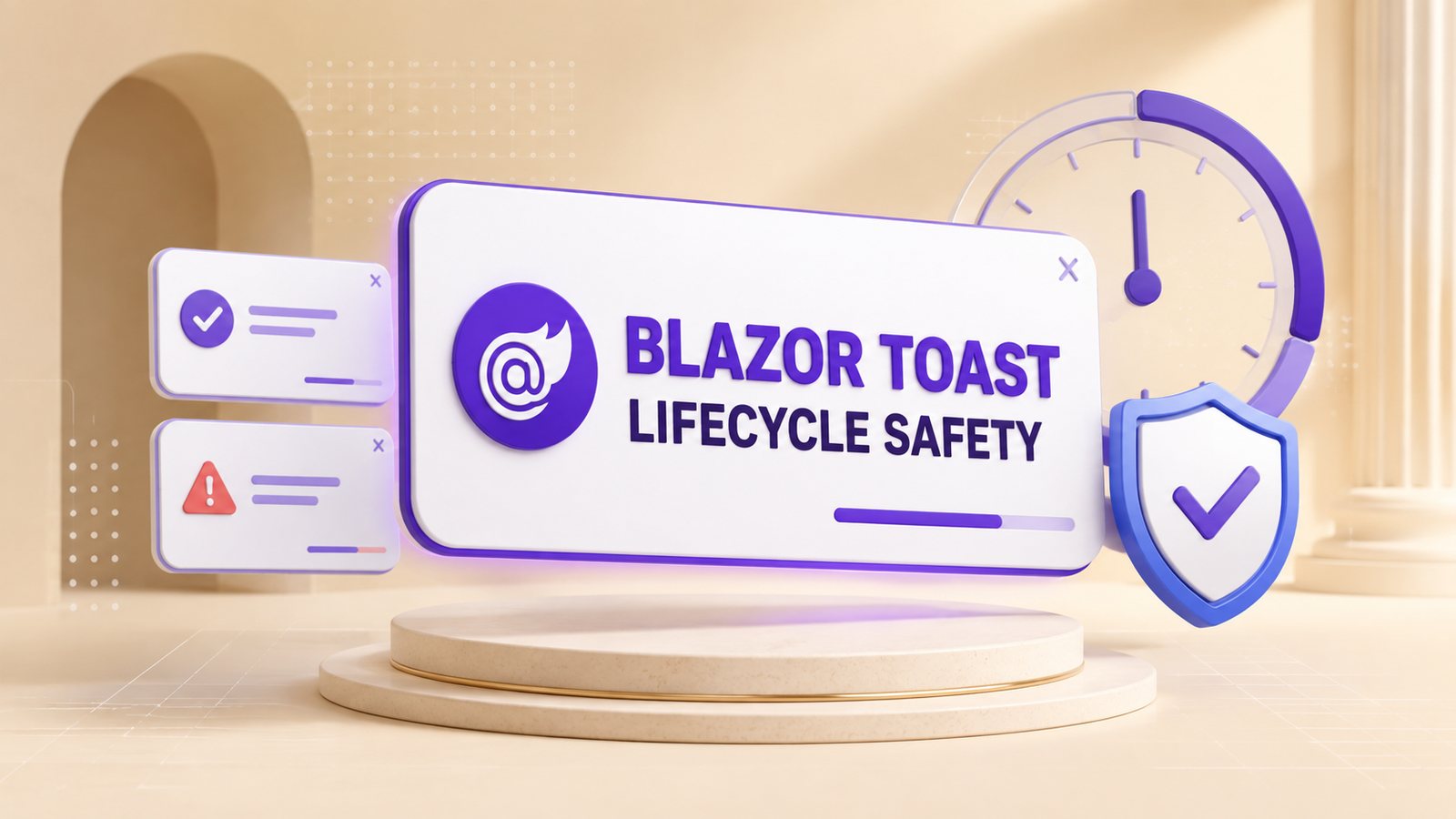
A Blazor toast notification can report success, failure, warnings, and background progress without interrupting the current page. The practical design is a host component placed once in the layout, a small service-facing contract, and a toast component that owns rendering and dismissal. The historical implementation below demonstrates that pattern with C#, Razor markup, and CSS.
Version note: the article, repository, and recording were produced with .NET 8 on May 30, 2024. The original code is preserved unchanged because it represents the demonstrated implementation. This editorial refresh explains the design and its production risks; it does not claim that the repository was rebuilt or retested against a newer .NET SDK.
Table of Contents
How the original design works
The original solution contains a Razor class library named Dnc.Common.Razor and a Blazor Web App named Dnc.Toast.WebApp. A wrapper around the layout exposes a toast service through a cascading value. The toast component registers itself with that wrapper, and descendant pages call the wrapper to display a message.
This is a component-local service locator rather than a dependency-injection service. It keeps the sample small and makes the host available to every descendant, but it also couples callers to the wrapper instance. The earlier Blazor toast component uses a related UI pattern and is the closest existing DotNetCoder prerequisite.
- Wrapper: owns the reference to the active toast implementation.
- Contract: exposes success, error, warning, info, and close operations.
- Toast component: maps a notification type to text, color, icon, visibility, and lifetime.
- Layout: creates one host for the page subtree.
- Caller: requests a notification without manipulating the toast markup directly.
Build the original .NET 8 component
Create a blank solution named Toast, then add a Razor Class Library named Dnc.Common.Razor. The repository targets net8.0. The following blocks reproduce the original component code exactly; the review after the implementation identifies changes to consider before production reuse.
Create the wrapper
The base class accepts arbitrary child content. The Razor component then cascades its own instance through that content, which allows nested components and pages to receive the same wrapper.
namespace Dnc.Common.Razor.Wrapper
{
    public class DncWrapperComponent:ComponentBase
    {
        [Parameter]
        public RenderFragment ChildContent { get; set; }
    }
}
@inherits DncWrapperComponent
<div class="dnc-wrapper">
<CascadingValue Value="this">
@ChildContent
</CascadingValue>
</div>The cascading value is the connection between the layout host and callers. Because the wrapper instance is stateful, the application should render a single intended host for a subtree rather than creating unrelated nested hosts accidentally.
Define toast types and the contract
The enum provides four visual categories. The interface gives each category a method and accepts an optional duration; a null duration leaves the notification visible until it is closed or navigation clears it.
namespace Dnc.Common.Razor.Enums
{
    public enum ToastType
    {
        Success,
        Error,
        Warning,
        Info
    }
}
namespace Dnc.Common.Razor.Interfaces
{
public interface IToastService
{
Task ShowSuccessToast(string message, string header, TimeSpan? duration = null);
Task ShowErrorToast(string message, string header, TimeSpan? duration = null);
Task ShowWarningToast(string message, string header, TimeSpan? duration = null);
Task ShowInfoToast(string message, string header, TimeSpan? duration = null);
void Close();
}
}These asynchronous methods describe the component’s timing behavior, but the completed wrapper later exposes them through void methods. That mismatch matters in production because callers cannot await completion or observe exceptions.
Create the toast component
The component registers itself with the wrapper during initialization, stores the current message and visual state, and subscribes to navigation changes only while a toast is active. A timed notification awaits Task.Delay and then clears itself.
namespace Dnc.Common.Razor.Toast
{
    public class DncToastComponent : ComponentBase, IToastService, IDisposable
    {
        [CascadingParameter]
        protected DncWrapperComponent DncWrapper { get; set; }

        [Inject]
        protected NavigationManager NavigationManager { get; set; }
        protected bool Show { get; set; }
        private string currentLocation = string.Empty;

        protected string Header { get; set; }
        protected MarkupString Message { get; set; }
        protected string ToastBackgroundColor { get; set; }
        protected string ToastIconCss { get; set; }

        protected override void OnInitialized()
        {
            DncWrapper.SetToastService(this);
        }
        public void Close()
        {
            Show = false;
        }
        public void Dispose()
        {
            NavigationManager.LocationChanged -= NavigationHandler;
        }
        public async Task ShowSuccessToast(string message, string header, TimeSpan? duration = null)
        {
            await ShowToast(message, header, ToastType.Success, duration);
        }
        public async Task ShowErrorToast(string message, string header, TimeSpan? duration = null)
        {
            await ShowToast(message, header, ToastType.Error, duration);
        }
        public async Task ShowWarningToast(string message, string header, TimeSpan? duration = null)
        {
            await ShowToast(message, header, ToastType.Warning, duration);
        }
        public async Task ShowInfoToast(string message, string header, TimeSpan? duration = null)
        {
            await ShowToast(message, header, ToastType.Info, duration);
        }
        private async Task ShowToast(string message, string header, ToastType toastType, TimeSpan? duration = null)
        {
            Show = true;
            Message = (MarkupString)message;

            switch (toastType)
            {
                case ToastType.Success:
                    ToastBackgroundColor = "dnc-toast-success";
                    ToastIconCss = "check";
                    Header = string.IsNullOrEmpty(header) ? "Success" : header;
                    break;

                case ToastType.Error:
                    ToastBackgroundColor = "dnc-toast-error";
                    ToastIconCss = "times";
                    Header = string.IsNullOrEmpty(header) ? "Error" : header;
                    break;

                case ToastType.Warning:
                    ToastBackgroundColor = "dnc-toast-warning";
                    ToastIconCss = "exclamation";
                    Header = string.IsNullOrEmpty(header) ? "Warning" : header;
                    break;

                case ToastType.Info:
                    ToastBackgroundColor = "dnc-toast-info";
                    ToastIconCss = "info";
                    Header = string.IsNullOrEmpty(header) ? "Info" : header;
                    break;
            }

            currentLocation = NavigationManager.Uri;
            NavigationManager.LocationChanged -= NavigationHandler;
            NavigationManager.LocationChanged += NavigationHandler;
            StateHasChanged();

            if (duration != null)
            {
                await Task.Delay((TimeSpan)duration);
                Clear();
            }
        }
        private void NavigationHandler(object sender, LocationChangedEventArgs args)
        {
            if (!string.Equals(args.Location, currentLocation, StringComparison.OrdinalIgnoreCase))
            {
                Clear();
                NavigationManager.LocationChanged -= NavigationHandler;
                StateHasChanged();
            }
        }
        public void Clear()
        {
            Show = false;
            StateHasChanged();
        }
    }
}
The navigation handler removes the toast after the URI changes, and Dispose detaches the event handler when the component leaves the render tree. This cleanup is necessary because a long-lived publisher such as NavigationManager can otherwise retain the component through the event subscription.
The line Message = (MarkupString)message deliberately renders the string as markup. Preserve it only when every message is trusted, controlled content. A message containing user input, exception text, API data, or database content must be rendered as ordinary encoded text or sanitized with a proven policy before conversion to MarkupString.
Render and style the toast
The Razor markup assigns an assertive live region and provides a close action. The CSS fixes the toast in the top-right corner and maps each notification type to a color family.
@inherits DncToastComponent

<div class="dnc-toast-container">
    <div class="dnc-toast fade @(Show ? "show" : "hide") @ToastBackgroundColor" role="alert" aria-live="assertive" aria-atomic="true">
        <div class="dnc-toast-header">
            <i class="fas fa-@ToastIconCss" aria-hidden="true"></i>
            <strong class="me-auto">@Header</strong>
            <a href="javascript:void(0)" @onclick="Close">
                <i class="fa fa-times dnc-toast-close"></i>
            </a>
        </div>
        <div class="dnc-toast-body">
            @Message
        </div>
    </div>
</div>
.dnc-toast-container {
position: fixed;
top: 20px;
right: 20px;
z-index: 9999;
}
.dnc-toast {
display: flex;
flex-direction: column;
border-radius: 5px;
box-shadow: 0 2px 10px rgba(0, 0, 0, 0.1);
color: #fff;
min-width: 300px;
overflow: hidden;
}
.dnc-toast-header {
display: flex;
align-items: center;
padding: 10px 20px;
}
.dnc-toast-header i {
color: #fff;
margin-right: 10px;
font-size: 1.5em;
}
.dnc-toast-header .me-auto {
flex-grow: 1;
font-weight: bold;
color: #fff;
}
.dnc-toast-close {
color: #fff;
font-size: 16px;
line-height: 1;
background: transparent;
border: 0;
cursor: pointer;
}
.dnc-toast-body {
padding: 15px 20px;
font-size: 1em;
}
.dnc-toast.fade.show {
opacity: 1;
animation: slide-in 0.5s forwards;
}
.dnc-toast.hide {
opacity: 0;
animation: slide-in 0.5s forwards;
}
.dnc-toast-success {
background-color: #4caf50;
}
.dnc-toast-success .dnc-toast-header {
background-color: #388e3c;
border-bottom: 1px solid #4caf50;
}
.dnc-toast-error {
background-color: #f44336;
}
.dnc-toast-error .dnc-toast-header {
background-color: #d32f2f;
border-bottom: 1px solid #f44336;
}
.dnc-toast-warning {
background-color: #ff9800;
}
.dnc-toast-warning .dnc-toast-header {
background-color: #f57c00;
border-bottom: 1px solid #ff9800;
}
.dnc-toast-info {
background-color: #2196f3;
}
.dnc-toast-info .dnc-toast-header {
background-color: #1976d2;
border-bottom: 1px solid #2196f3;
}
}The original close control is an anchor with javascript:void(0). A production component should use a real <button type="button"> with an accessible name. Use role="alert" only for urgent information that deserves immediate announcement; routine confirmations are usually better as a polite status region so they do not repeatedly interrupt assistive-technology users.
Complete the wrapper
The completed wrapper stores the registered service and forwards each public operation. This is the final historical version used by the sample.
namespace Dnc.Common.Razor.Wrapper
{
    public class DncWrapperComponent:ComponentBase
    {
        [Parameter]
        public RenderFragment ChildContent { get; set; }
        protected IToastService ToastService { get; set; }

        public void SetToastService(IToastService toastService)
        {
            ToastService = toastService;
        }

        public void ShowSuccessToast(string message, string header = null, TimeSpan? duration = null)
        {
            ToastService?.ShowSuccessToast(message, header, duration);
        }
        public void ShowErrorToast(string message, string header = null, TimeSpan? duration = null)
        {
            ToastService?.ShowErrorToast(message, header, duration);
        }
        public void ShowWarningToast(string message, string header = null, TimeSpan? duration = null)
        {
            ToastService?.ShowWarningToast(message, header, duration);
        }
        public void ShowInfoToast(string message, string header =null, TimeSpan? duration = null)
        {
            ToastService?.ShowInfoToast(message, header, duration);
        }
    }
}
The null-conditional calls avoid an immediate exception before the toast registers, but they also discard the returned Task. A hardened API should return Task from the forwarding methods and make callers await it. That preserves cancellation, exception handling, and predictable ordering.
Integrate the component into the Blazor app
Add a Blazor Web App named Dnc.Toast.WebApp, reference the Razor class library, and import the component namespaces. The following project screenshot and code belong to the original .NET 8 demonstration.
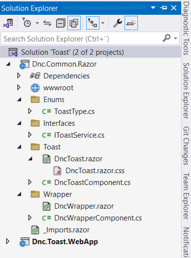
@using Dnc.Common.Razor.Wrapper
@using Dnc.Common.Razor.Toast
@using Dnc.Common.Razor.Enums
Place the wrapper and one toast component around the layout body. Descendant pages can then receive the same DncWrapper instance as a cascading parameter.
@inherits LayoutComponentBase
<DncWrapper>
    <DncToast />
    <div class="container">
        @Body
    </div>
</DncWrapper>
The sample home page calls all four notification types. Three messages remain visible until dismissed, while the info toast supplies a five-second duration.
@page "/"

<PageTitle>Home</PageTitle>

<div class="container">
    <div class="row">
        <div class="col">
            <div class="center-block">
                <div class="btn-group-vertical" role="group" aria-label="Vertical button group">
                    <button class="btn btn-success" @onclick="ShowSuccess">Show success toast</button>
                    <button class="btn btn-danger" @onclick="ShowError">Show error toast</button>
                    <button class="btn btn-warning" @onclick="ShowWarning">Show warning toast</button>
                    <button class="btn btn-info" @onclick="ShowInfo">Show info toast</button>
                </div>
            </div>
        </div>
    </div>
</div>

@code {

    [CascadingParameter]
    public DncWrapper DncWrapper { get; set; }

    public void ShowSuccess()
    {
        // DncWrapper.ShowSuccessToast("Success Toast Message", null, TimeSpan.FromSeconds(3));
        DncWrapper.ShowSuccessToast("Success Toast Message");
    }
    public void ShowError()
    {
        // DncWrapper.ShowErrorToast("This is Error Message", TimeSpan.FromSeconds(5));
        DncWrapper.ShowErrorToast("Error Toast Message");
    }
    public void ShowWarning()
    {
        // DncWrapper.ShowWarningToast("This is Warning Message", TimeSpan.FromSeconds(5));
        DncWrapper.ShowWarningToast("Warning Toast Message", "Custom title");
    }
    public void ShowInfo()
    {
        DncWrapper.ShowInfoToast("This will disappears after 3 sec", null, TimeSpan.FromSeconds(5));
        // DncWrapper.ShowInfoToast("This is Info Toast Message");
    }
}

In a current Blazor Web App, the page must run with an interactive render mode for click handlers and component state updates to execute. That requirement is separate from the historical repository target and must be configured and verified in the application that consumes the component.
Production risks to address
The recorded sample demonstrates the UI, but its small design leaves several production decisions to the consuming application. These are the highest-impact issues to resolve before reuse:
- Do not render untrusted HTML. Replace
MarkupStringwith a normal string unless the application owns and sanitizes the complete message. - Cancel the previous timeout. Two overlapping calls can race: the first delay may finish after a newer toast appears and clear the newer message. Keep a
CancellationTokenSourceper active toast, cancel it before starting the next delay, and cancel it during disposal. - Return and await tasks. Forwarding methods should return
Task; event handlers should await them so exceptions and ordering are not silently lost. - Marshal external notifications. If a background service raises the notification outside Blazor’s synchronization context, the component should update state through
InvokeAsync. Do not assume every service callback runs like a UI event. - Choose live-region urgency. Reserve an assertive alert for errors that require immediate attention. Use a polite status region for ordinary success and information messages.
- Use semantic controls. Replace the close anchor with a button, give it an accessible label, and keep keyboard focus in the user’s current workflow unless the message requires action.
- Define queue behavior. Decide whether a new toast replaces the current one, waits in a queue, or joins a bounded stack. The original implementation supports only one active message.
- Handle narrow screens and motion. Constrain width with the viewport, preserve the 15% page edge on mobile, and honor
prefers-reduced-motionwhen adding slide or fade animations. - Scope the host deliberately. One host per interactive subtree avoids competing wrapper instances. If the app uses dependency injection instead, choose a lifetime that does not share user notifications across server circuits.
The original CSS also applies the same slide-in animation to both the shown and hidden states. Opacity still hides the element, but the exit behavior is not defined independently. Treat animation naming and timing as presentation work that should be verified in the actual theme, including high contrast and reduced motion.
Verify the historical implementation
The repository remains a historical .NET 8 sample. To evaluate it today, use a machine with the .NET 8 SDK available, record dotnet --info, then run dotnet restore and dotnet build from the solution directory. A successful build proves compilation only; it does not prove the timing, navigation, security, or accessibility behavior described below.
- Four types: trigger success, error, warning, and info and confirm the expected header, color, icon, and message.
- Persistent toast: omit the duration and confirm the toast remains until the close control is activated.
- Timed toast: provide a short duration and confirm the toast disappears after that interval.
- Navigation: show a persistent toast, navigate to another route, and confirm the notification clears once.
- Overlapping timers: start a short timed toast, immediately show a longer one, and observe whether the first delay clears the second. This exposes the race that cancellation should prevent.
- Encoding: pass a harmless string containing
<strong>tags. If the text becomes bold, the component is rendering raw markup and must not receive untrusted content. - Keyboard and screen reader: activate every trigger and the close control without a mouse, verify an accessible close name, and confirm routine messages do not produce unnecessarily assertive announcements.
- Disposal: navigate away while a timed toast is waiting and check browser and server logs for callbacks or exceptions after disposal.
These are executable verification steps, not claims that this refresh ran them. The historical video proves the original visible result from May 2024; it does not establish compatibility with a newer framework, browser, theme, or accessibility stack.
Historical demo
The recording below shows the original .NET 8 toast notification in the Blazor Web App. It is preserved as historical evidence of the result and workflow.
References
- Microsoft Learn: ASP.NET Core Blazor synchronization context
- Microsoft Learn: ASP.NET Core Razor component disposal
- Microsoft Learn: Consume ASP.NET Core Razor components from a Razor class library
- W3C WAI-ARIA Authoring Practices: Alert pattern
- Microsoft: .NET and .NET Core support policy
Demo source code: View the original .NET 8 example on GitHub.
Found this useful? Support more practical developer content.